Objective
The National Gallery of Art is distinctive for its vast and exceptional collection of art
and its beautiful neoclassical architecture. Located in our nation’s capital, the gallery
is celebrated for its accessibility, inclusiveness, and its leadership in the art community. However, it suffers greatly from a weak and dated brand identity and expression.
and its beautiful neoclassical architecture. Located in our nation’s capital, the gallery
is celebrated for its accessibility, inclusiveness, and its leadership in the art community. However, it suffers greatly from a weak and dated brand identity and expression.
Solution
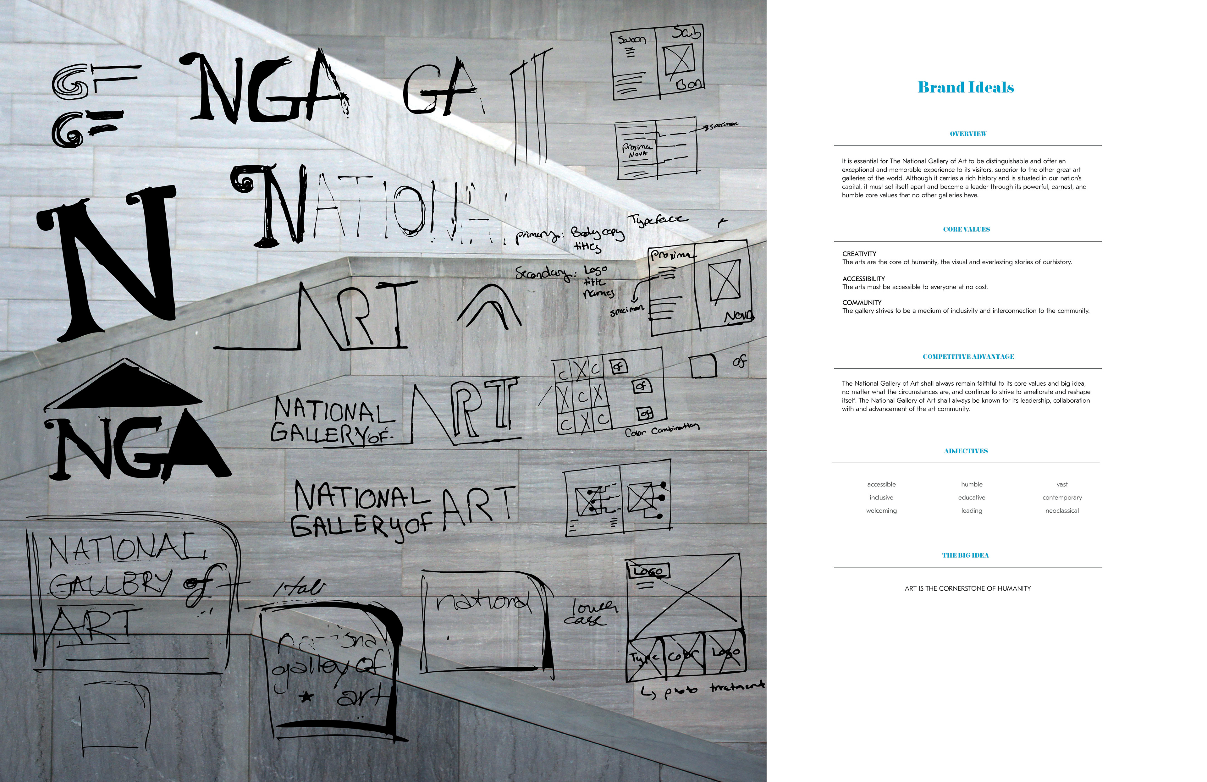
After performing a brand audit and an external audit of its competitors, I was able to
define the core values of the gallery and discovered its story and big idea. This lead
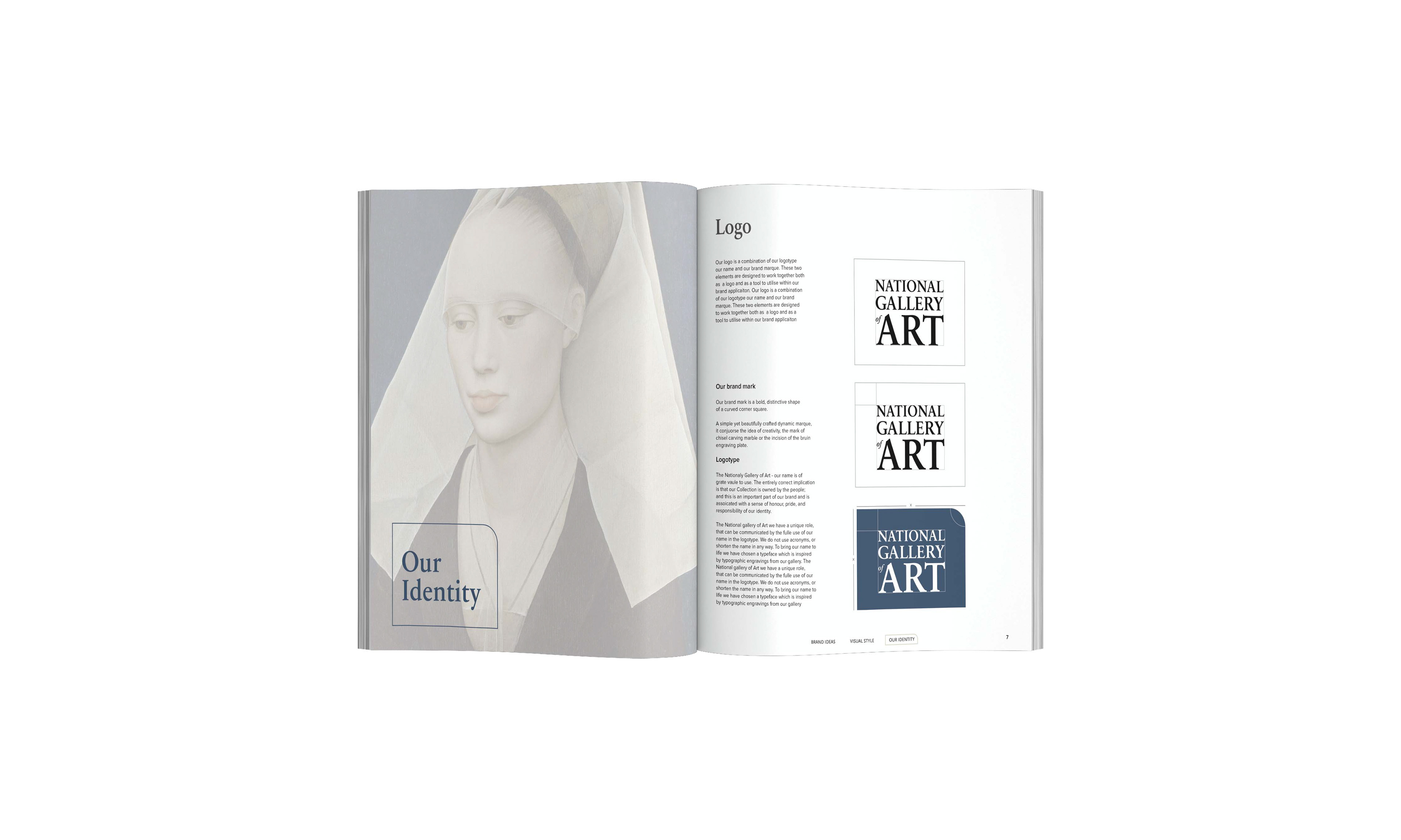
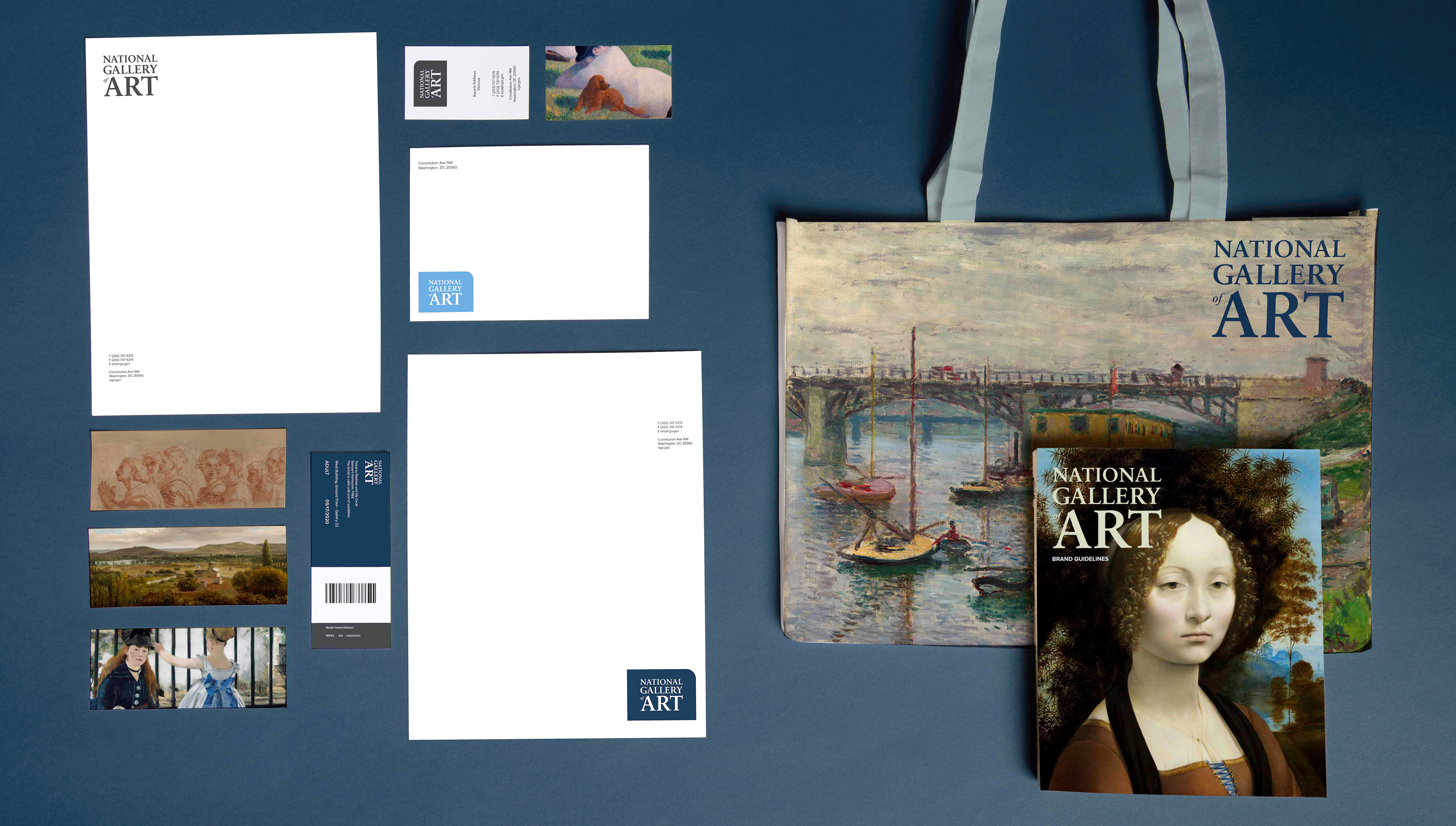
me to solutions for an appropriate rebrand while maintaining key elements of its original brand equity. The primary logo is a word mark, that is contained in a one rounded corner square or without. The rounded one corner square is to represent the modernness and
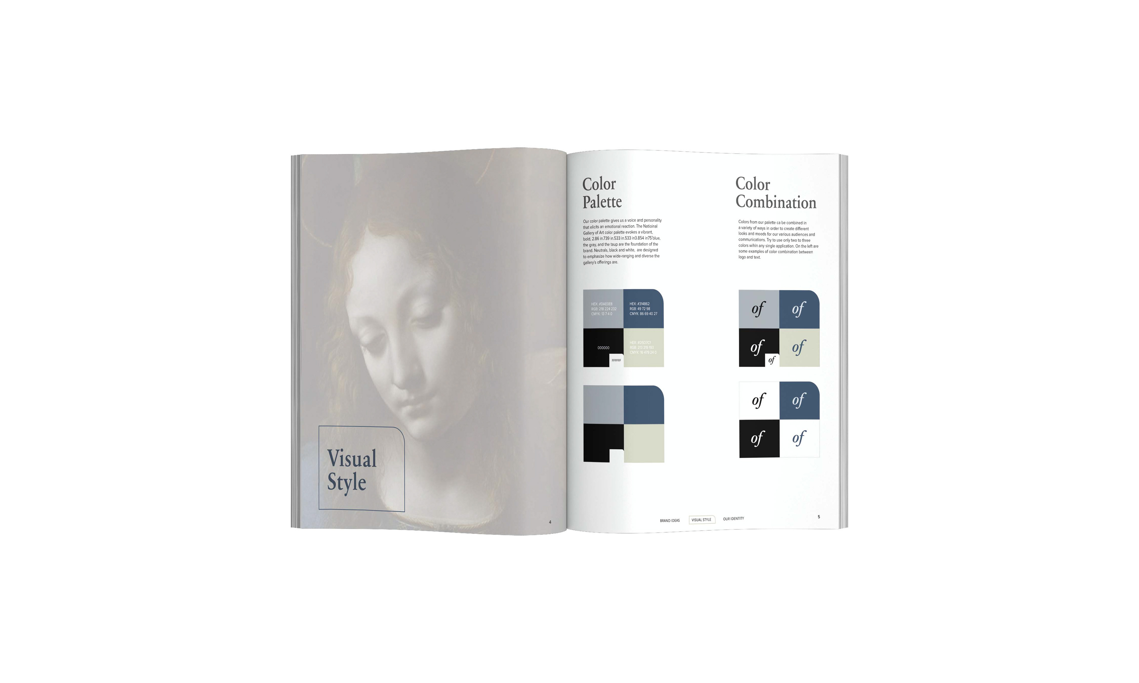
the dynamic platform of the future of the gallery. While the serif typeface Sabon Next reflects its distinct traditional heritage, and the neoclassical architecture of the gallery. Proxima nova is the sans serif typeface that I selected as the typeface to be used across
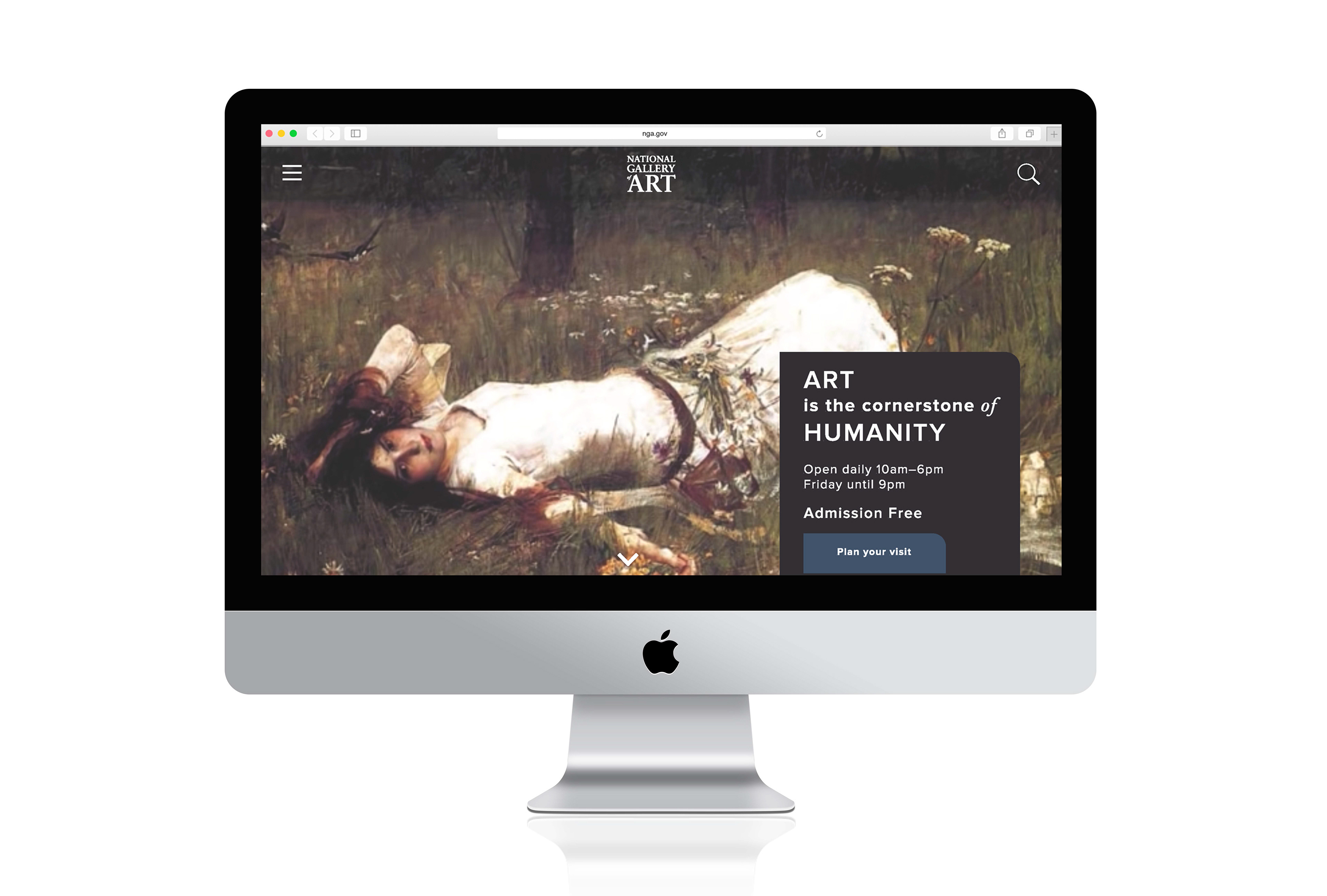
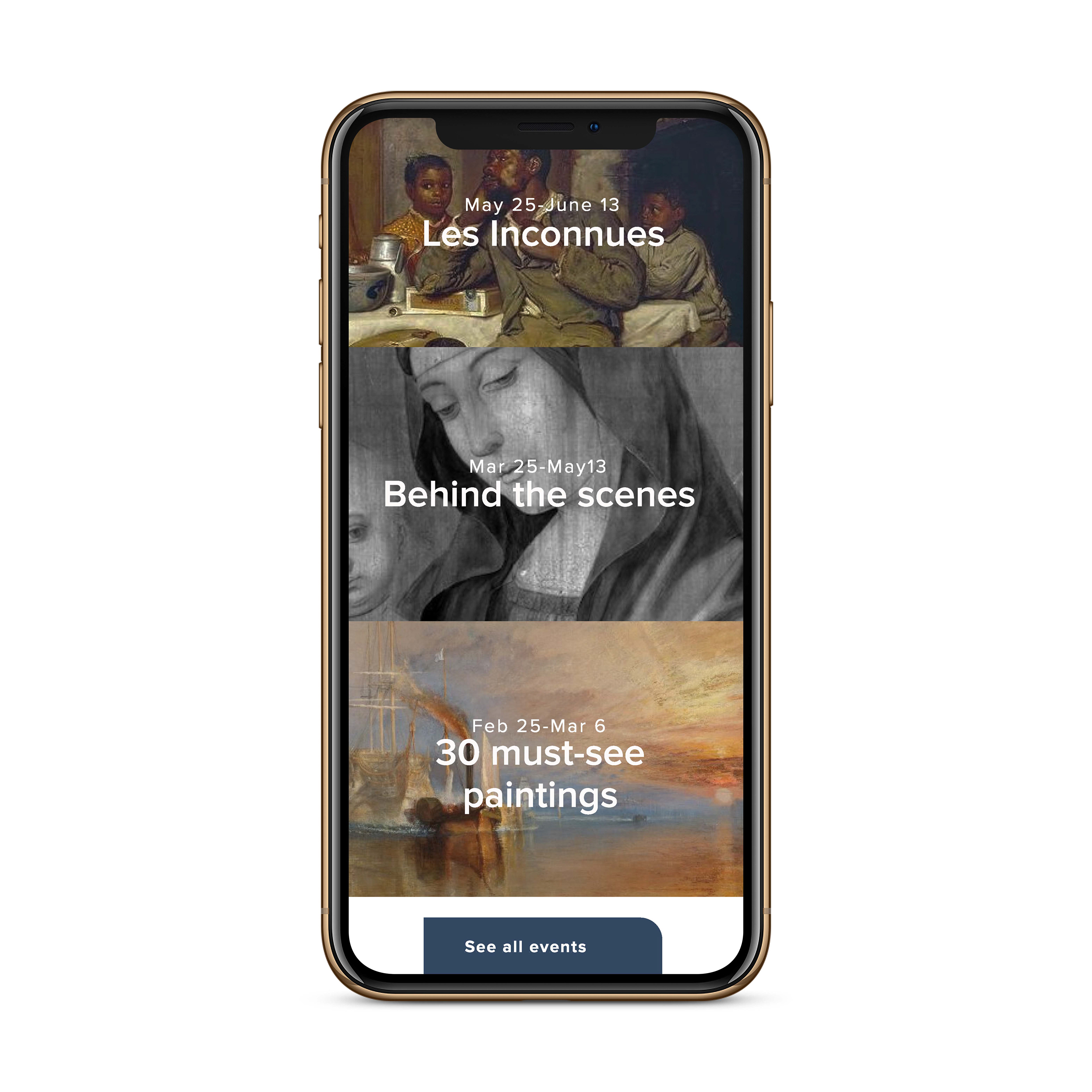
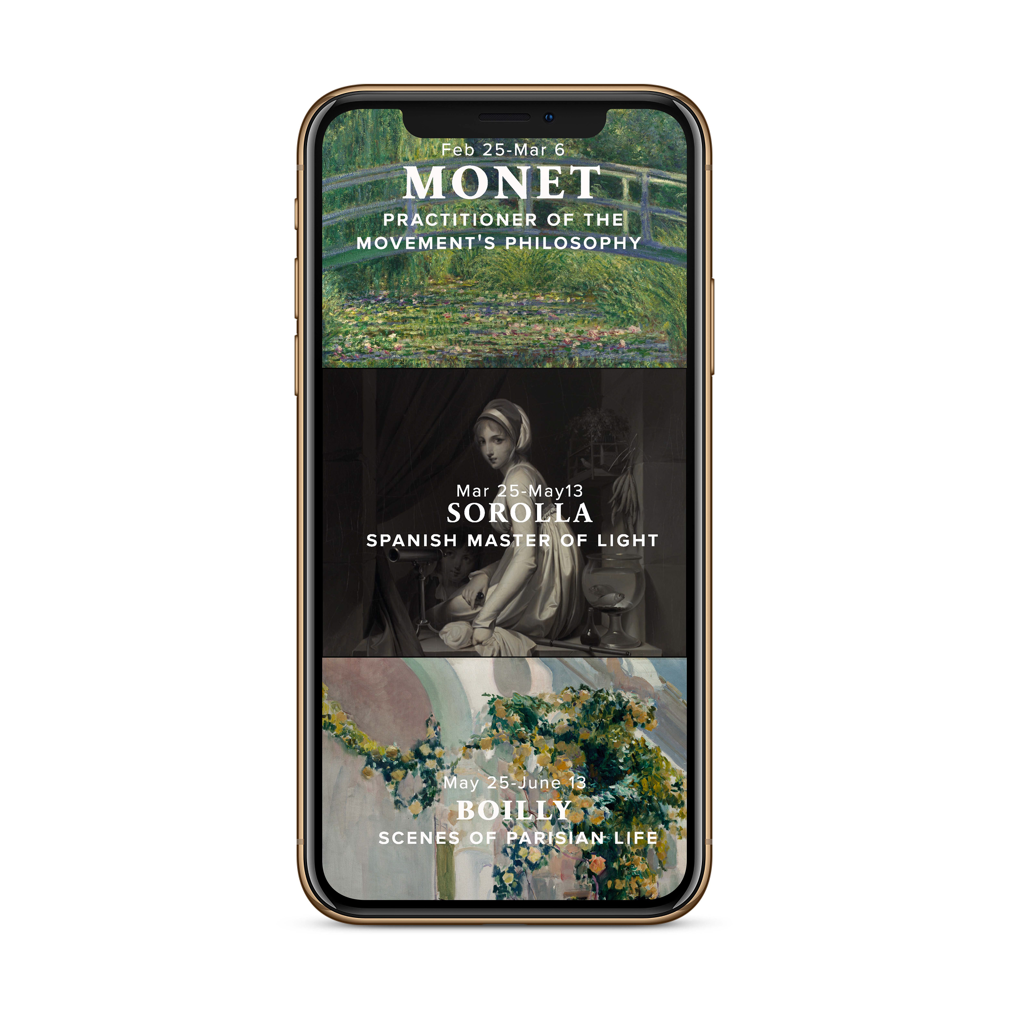
a huge range of applications. It has beautiful geometric appearance with developed proportions. The existing deep muted color palette with two warm neutrals integrated seamlessly with the new brand identity. To celebrate the brilliance and the vast collections of art work, I designed the new website through bold use of imagery. It is minimal, and confirms to contemporary trends of website designs.
define the core values of the gallery and discovered its story and big idea. This lead
me to solutions for an appropriate rebrand while maintaining key elements of its original brand equity. The primary logo is a word mark, that is contained in a one rounded corner square or without. The rounded one corner square is to represent the modernness and
the dynamic platform of the future of the gallery. While the serif typeface Sabon Next reflects its distinct traditional heritage, and the neoclassical architecture of the gallery. Proxima nova is the sans serif typeface that I selected as the typeface to be used across
a huge range of applications. It has beautiful geometric appearance with developed proportions. The existing deep muted color palette with two warm neutrals integrated seamlessly with the new brand identity. To celebrate the brilliance and the vast collections of art work, I designed the new website through bold use of imagery. It is minimal, and confirms to contemporary trends of website designs.