Overview
"Typo Berlin" is an international design and typographic conference. This year’s theme, “Rewired,” focuses on the digital transformation of design and typography. The conference hopes to attract designers, typographers, and web developers from all over the world.
Solution
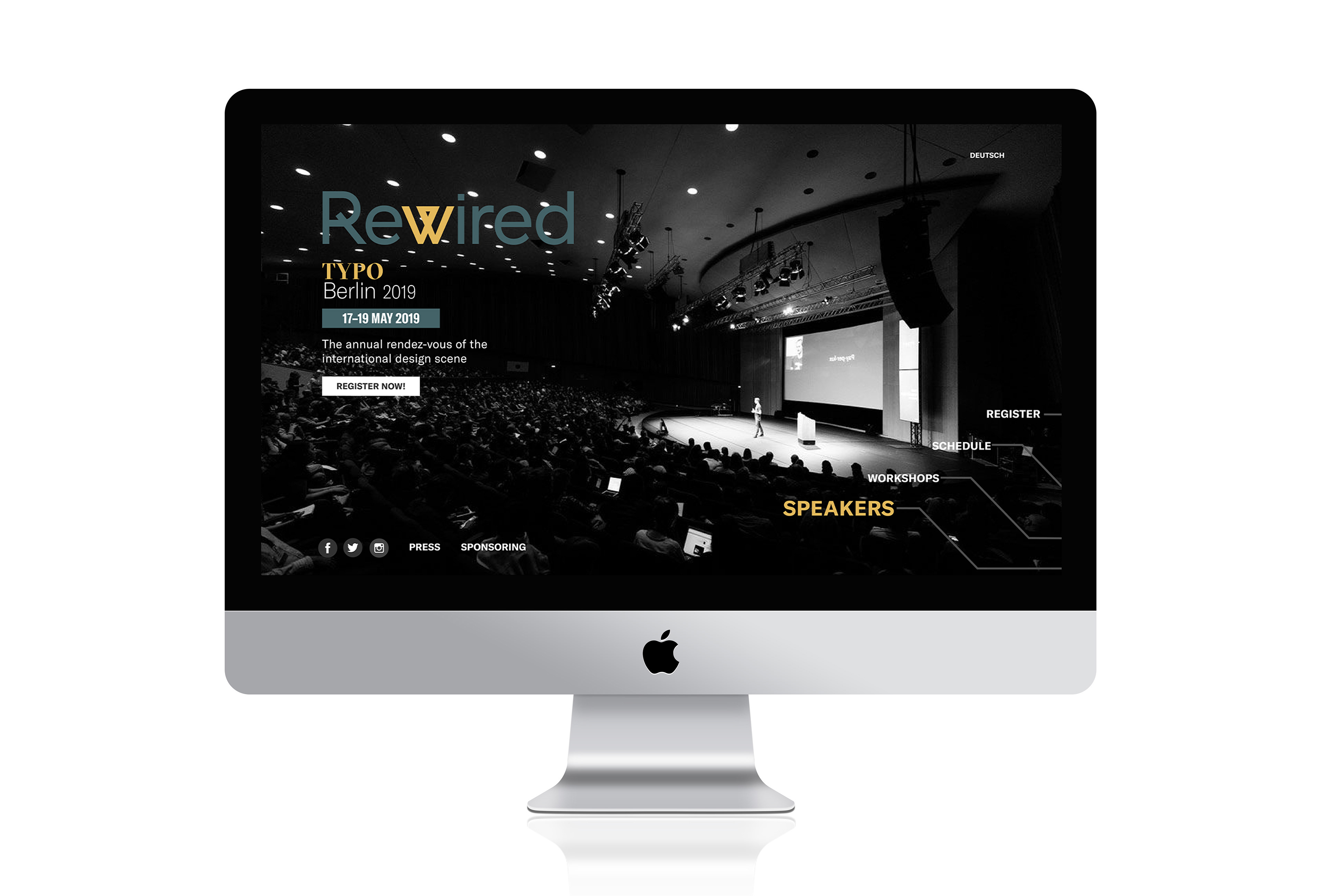
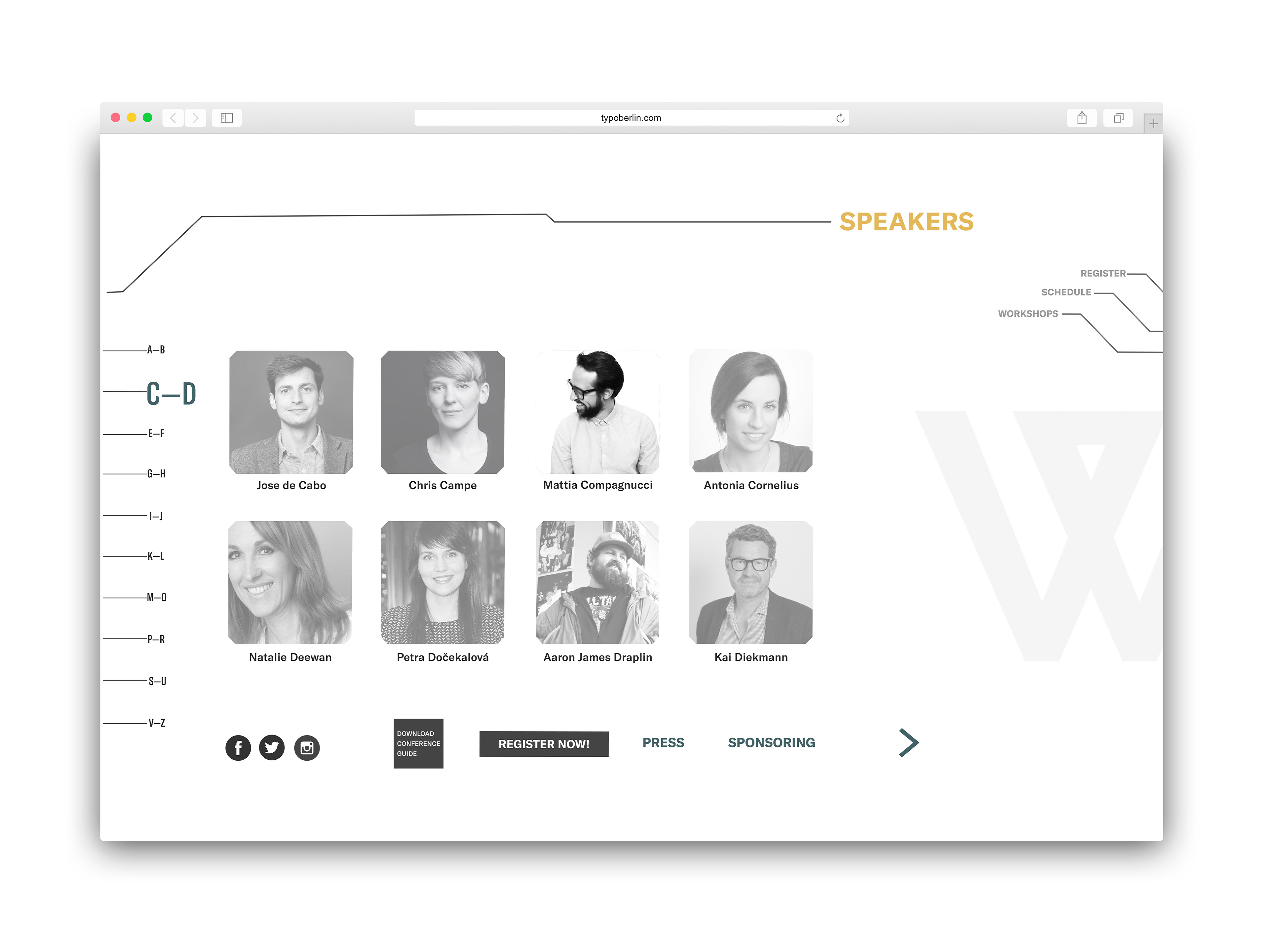
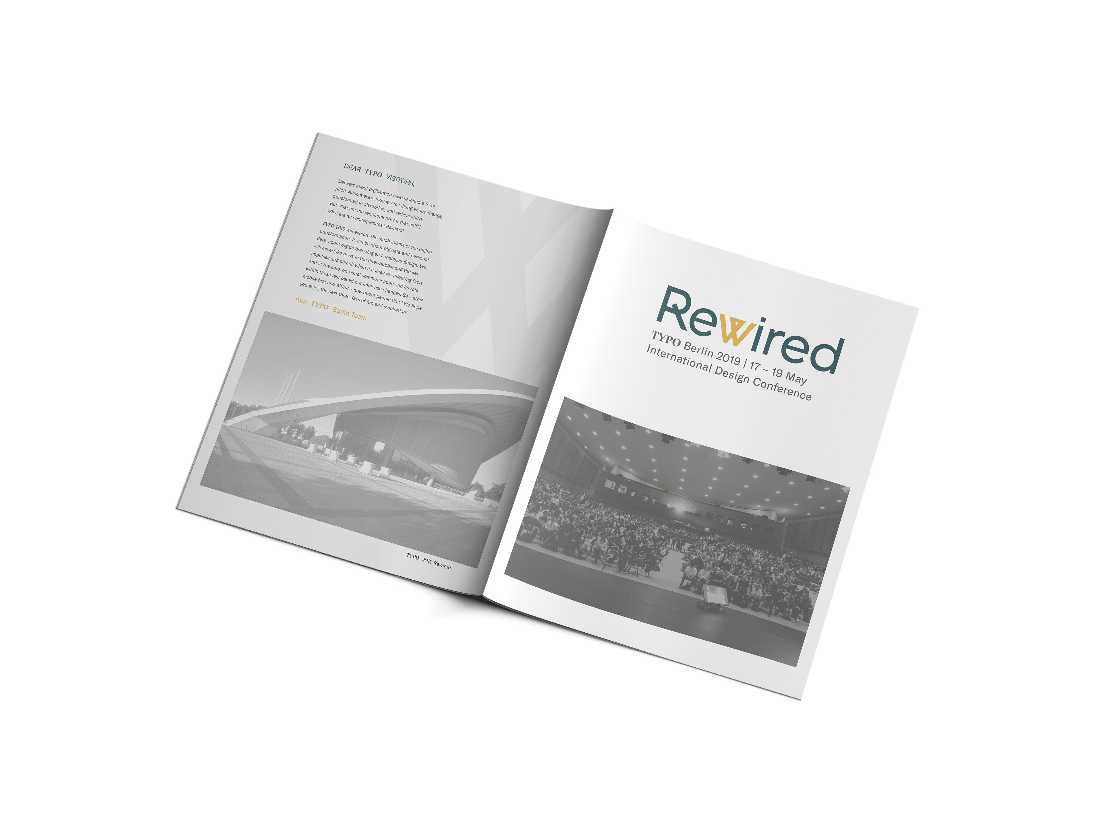
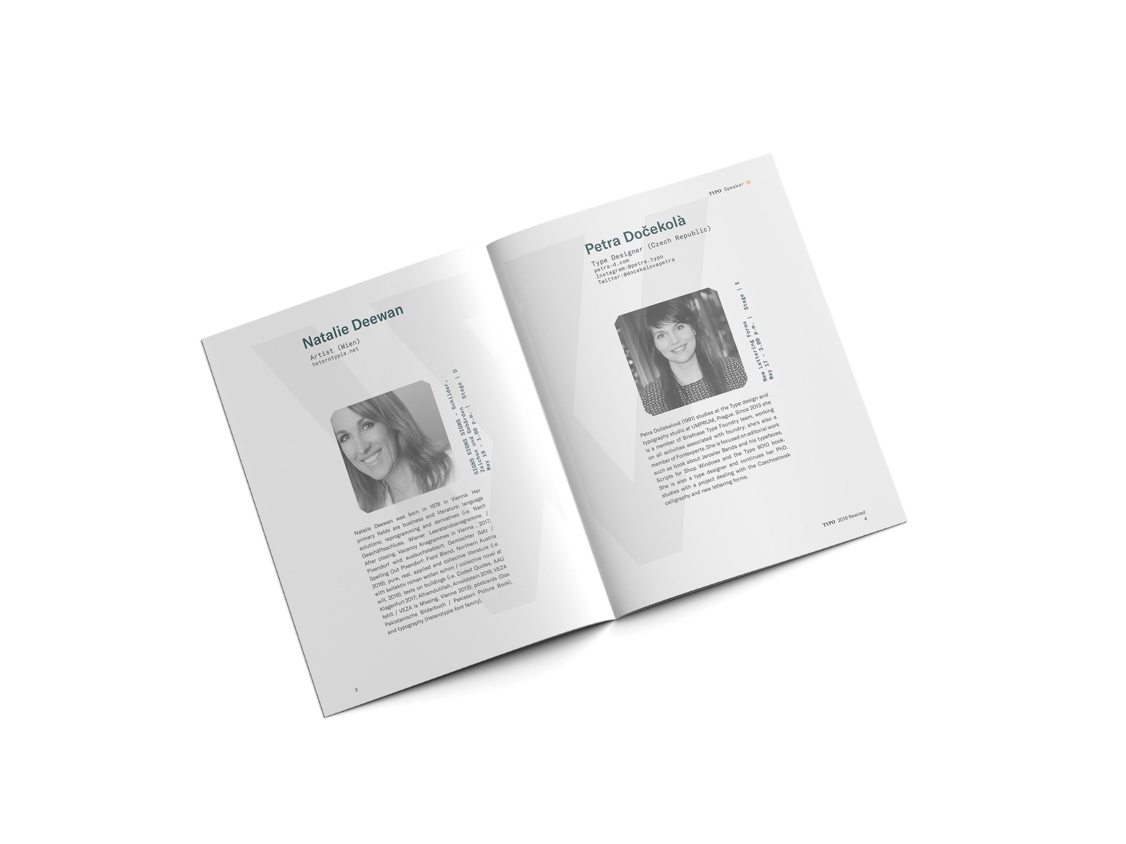
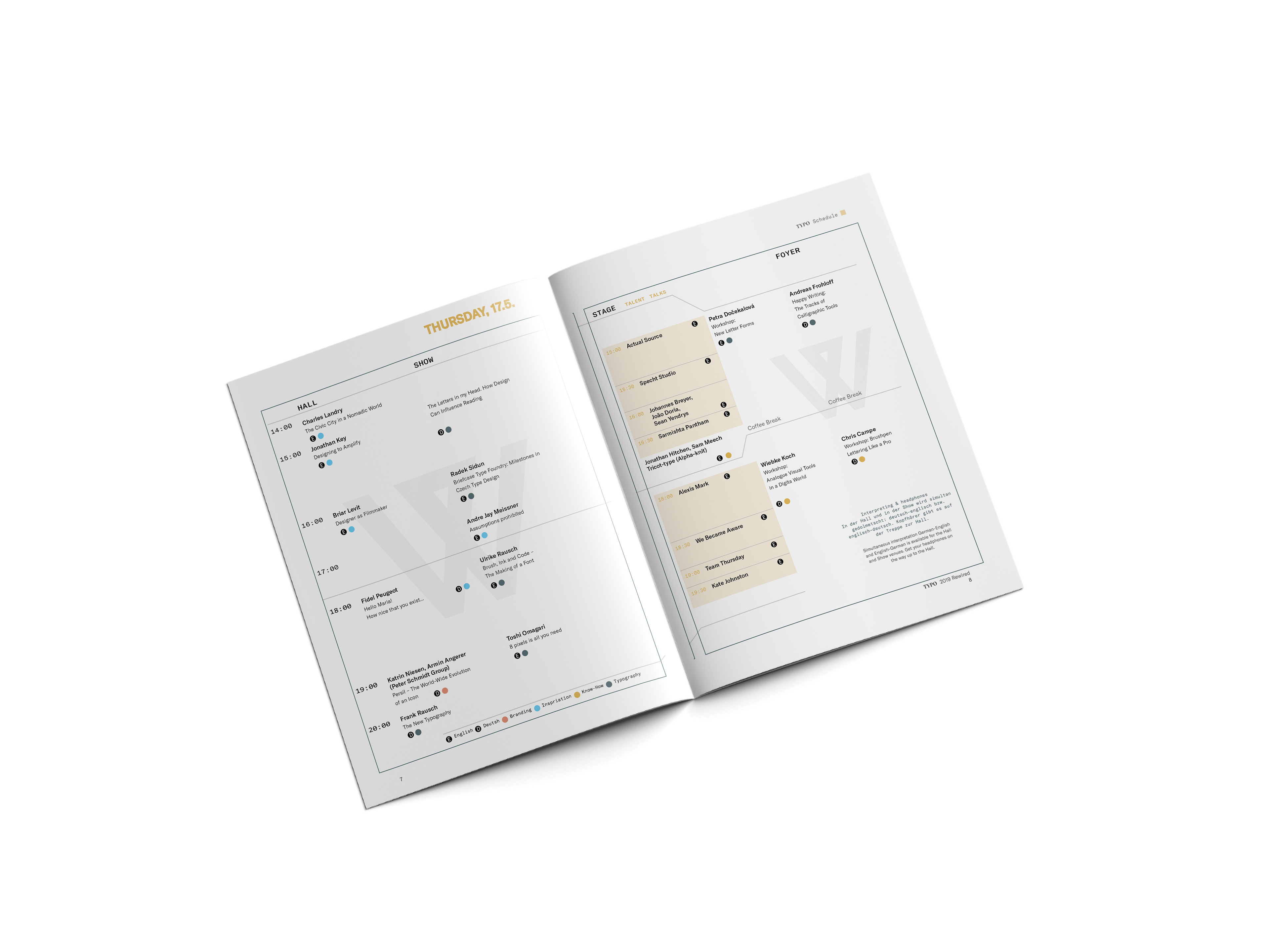
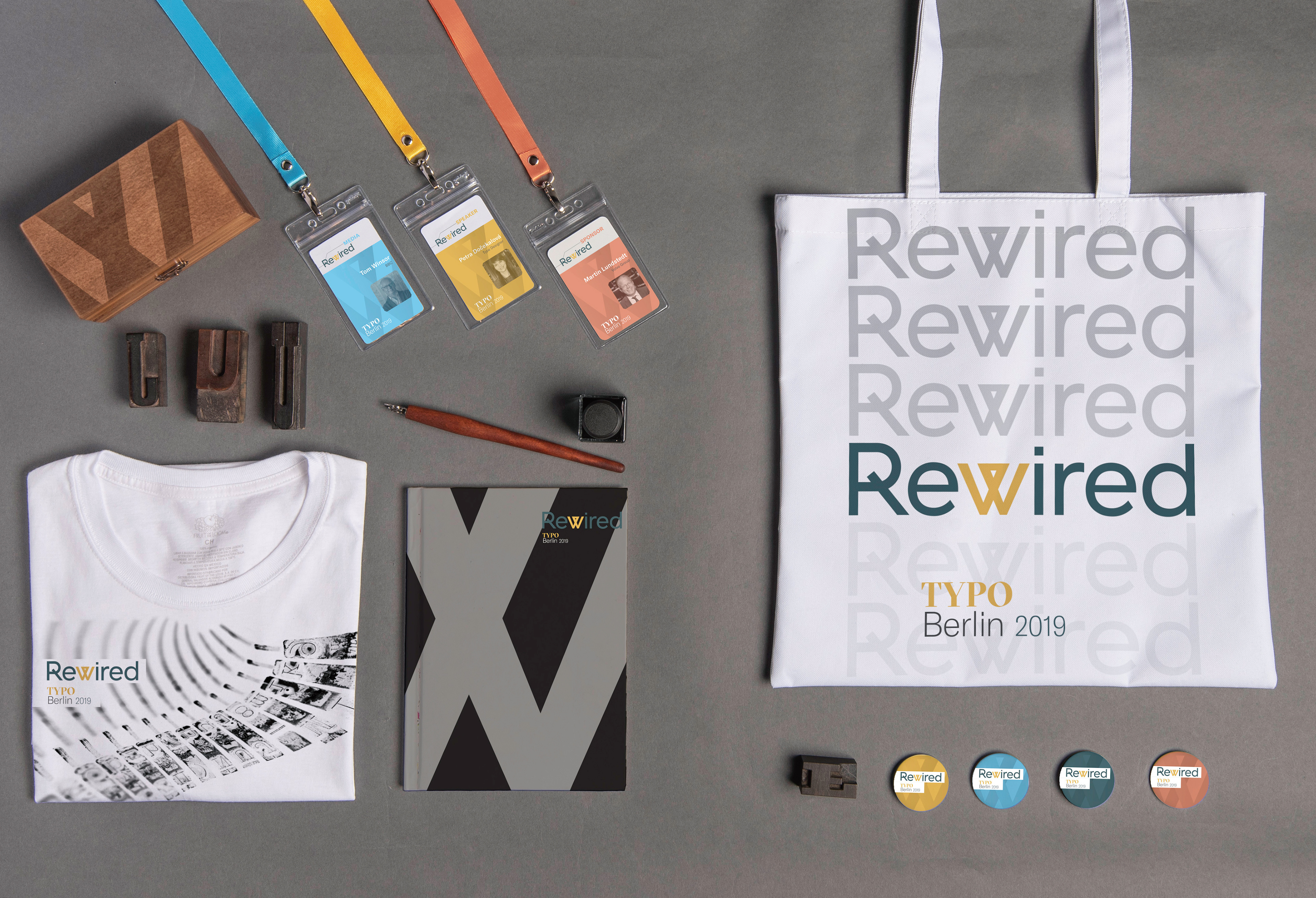
I branded the theme around a modified typographic logo and a consistent visual language system. I then applied it to the conference program, website, and other branded items.
The logo, a visual metaphor, is modified by merging and connecting two ‘V’ glyphs to convey a ‘W.’ It symbolizes the joining of the past and present traditions of design and typography and its continuous evolution to set new standards. I applied the modified ‘W’
as a design element to the branded deliverables. The brand typefaces, which belong to
the Swiss Grilli typographic foundry, are classically sophisticated, modern, and legible at any size or weight. I chose GT America for the theme logo because of its mono linear geometric aspect. The conference logo uses GT Sectra, a contemporary serif typeface combining the characteristics of calligraphy and sharpness. GT America’s widths and weights function optimally in title heads and body copy. The color palette is comprised
of four colors and two neutrals. The two primary colors, teal and yellow, render a sense
of illuminating positivity, trustworthy prosperity, and professional creativity. They are
accented by a light cyan and coral. Black and grey are an essential to support the
entire color palette.
Solution
I branded the theme around a modified typographic logo and a consistent visual language system. I then applied it to the conference program, website, and other branded items. The logo, a visual metaphor, is modified by merging and connecting two ‘V’ glyphs to convey a ‘W.’ It symbolizes the joining of the past and present traditions of design and typography and its continuous evolution to set new standards. I applied the modified ‘W’ as a design element to the branded deliverables. The brand typefaces, which belong to the Swiss Grilli typographic foundry, are classically sophisticated, modern, and legible at any size or weight. I chose GT America for the theme logo because of its monolinear geometric aspect. The conference logo uses GT Sectra, a contemporary serif typeface combining the characteristics of calligraphy and sharpness. GT America’s widths and weights function optimally in title heads and body copy. The color palette is comprised of four colors and two neutrals. The two primary colors, teal and yellow, render a sense of illuminating positivity, trustworthy prosperity, and professional creativity. They are accented by a light cyan and coral. Black and grey are an essential to support the entire color palette.
