Objective
A collaborative studio album by English alternative rock musicians, PJ Harvey and John Parish, is set to be released. The project needs a cohesive visual identity and versatile brand system that will appropriately represent the artists and the theme of the album.
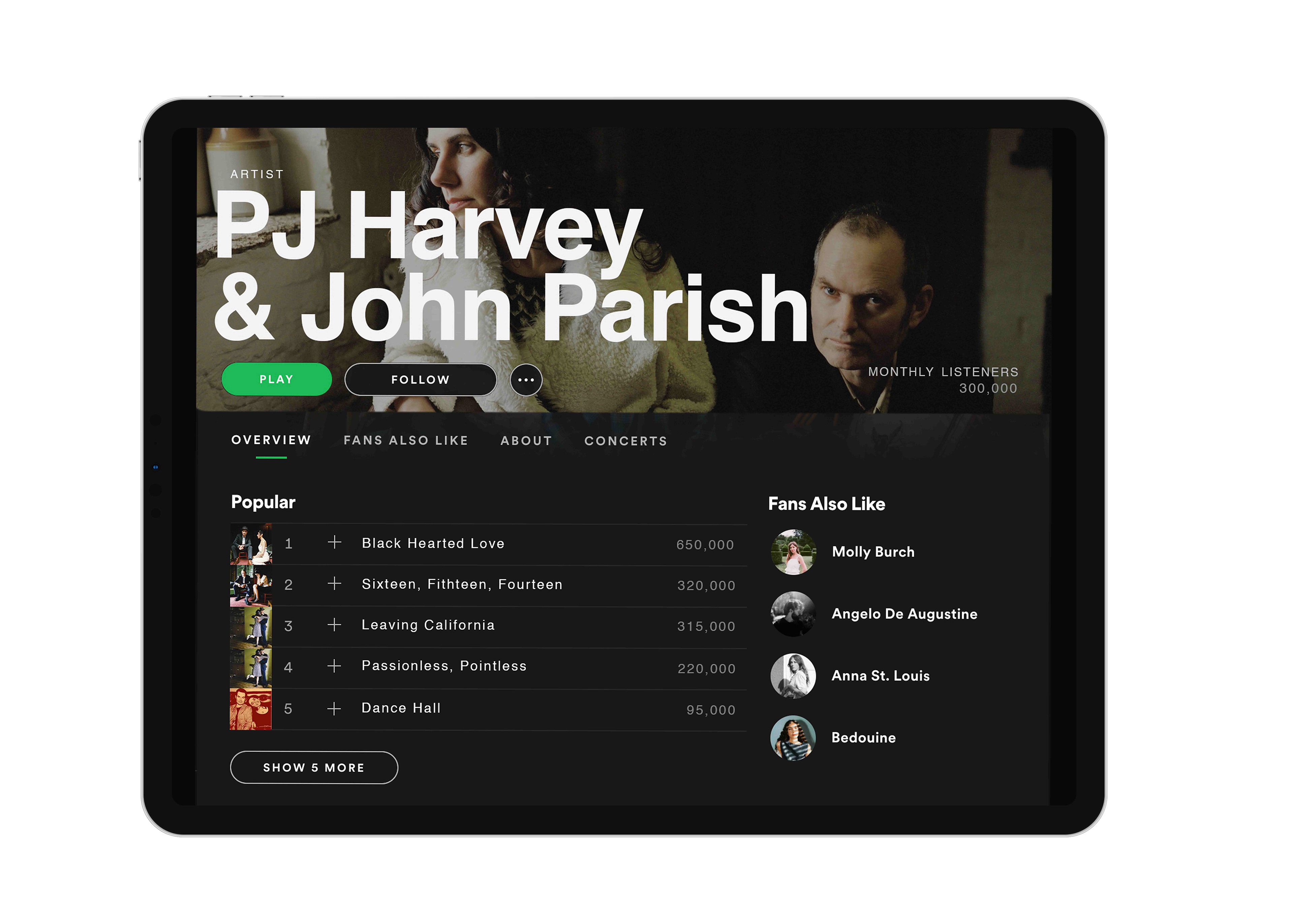
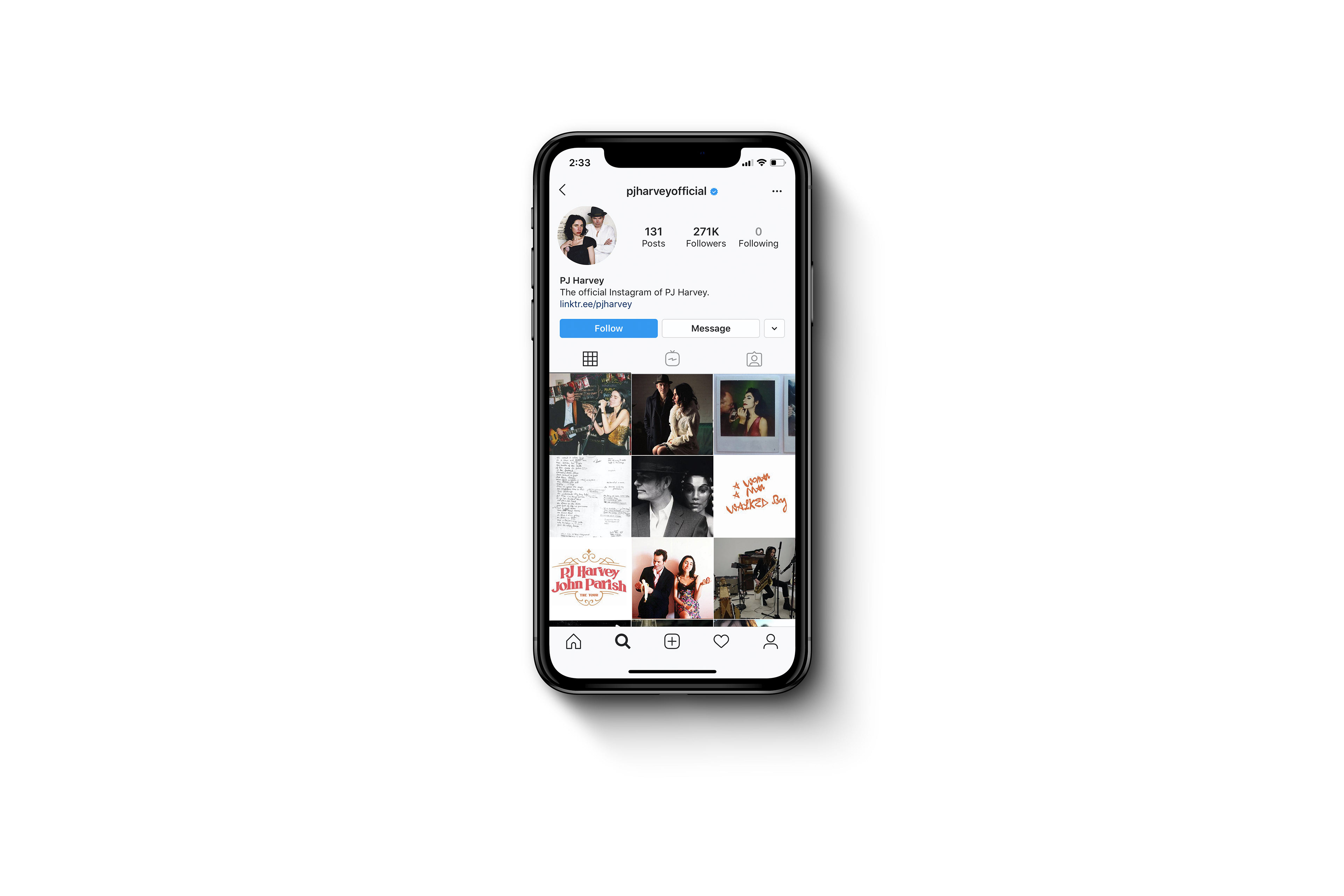
The visual identity shall be used on the album cover, promotional print & digital materials, and other branding applications.
The visual identity shall be used on the album cover, promotional print & digital materials, and other branding applications.
Solution
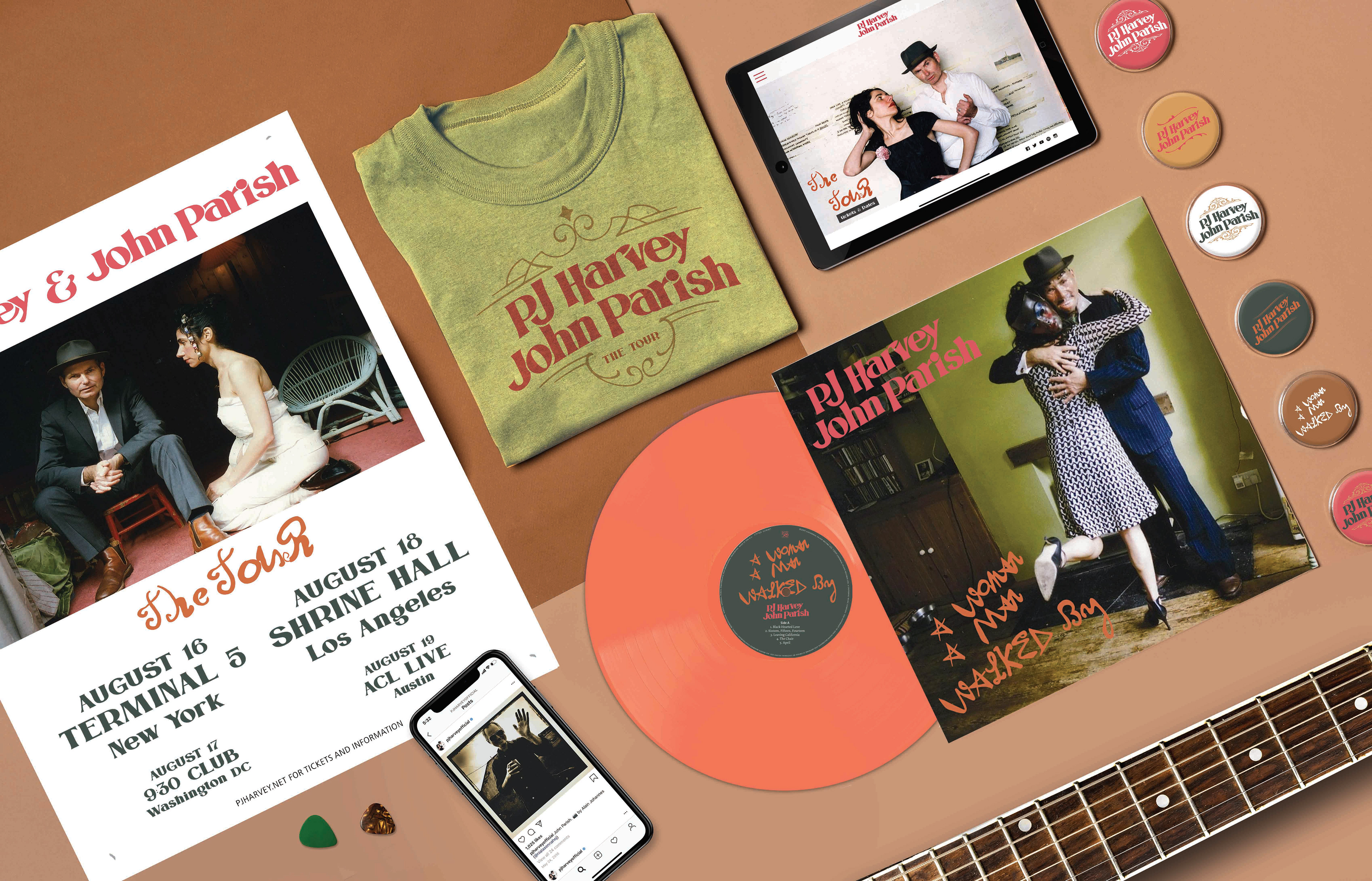
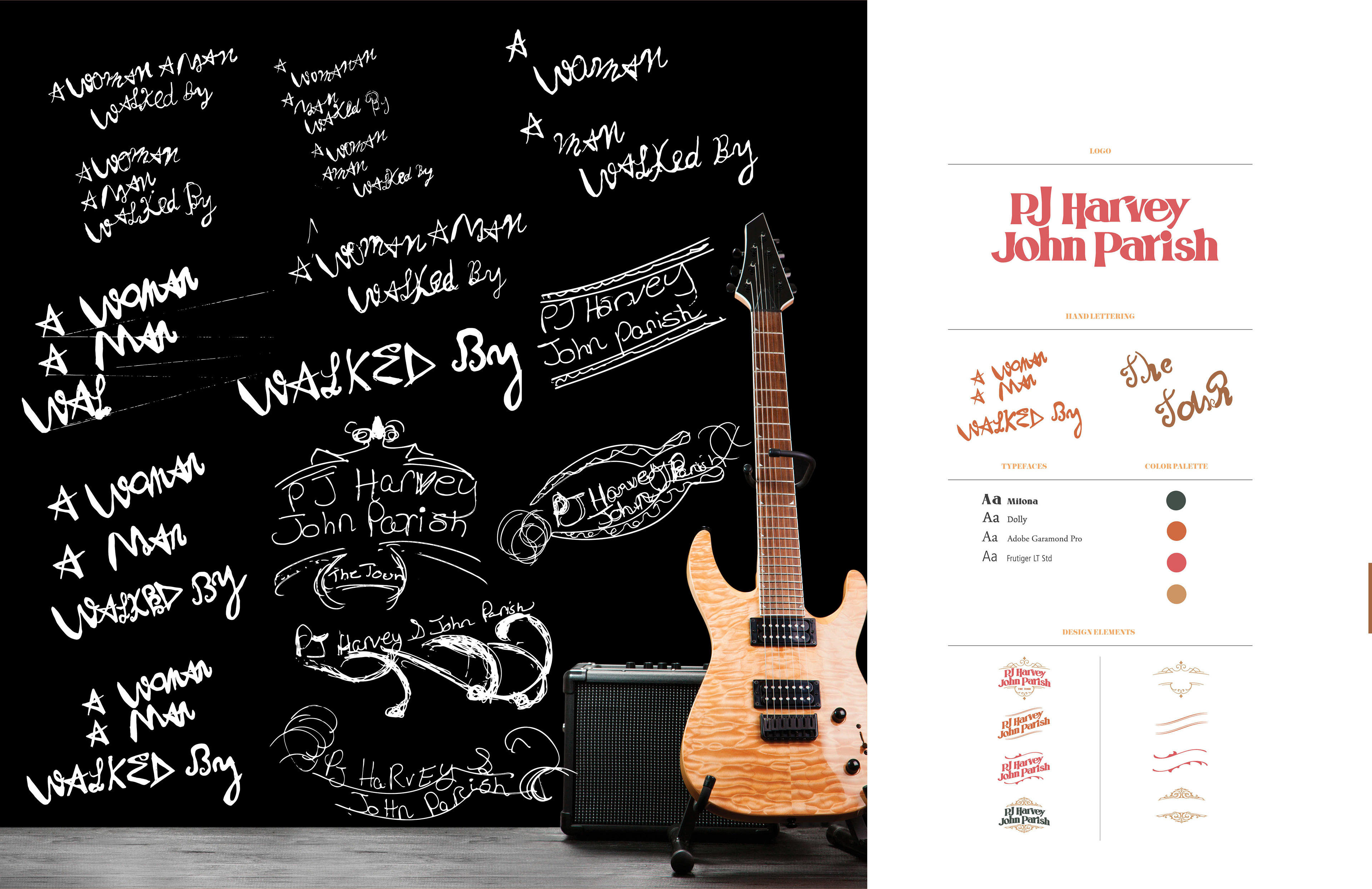
A modified typographic wordmark in a vintage style was a suitable choice for the rock alternative duo. I chose the typeface Milona, a serif font inspired by the Victorian era.
The variety of alternatives in each letter allows for versatile typographic design options.
I was able customize the type to create a logo that interlocked both of the artists’ names and incorporate the wordmark into various victorian ephemera. I hand lettered the album title and tagline to add more distinction to the overall system of visual identity. The style
of the hand lettering evokes anthemic grunge pop guitars, which relatesto the theme and genre of the album. A muted and muddy color palette of green, orange, red, and yellow compliments the mood and the nature of lighting of the photography. Secondary typefaces, such are Dolly, Adobe Garamond Pro, and Frutiger, were used for the copy on the album label and the lyrics sheet.