Objective
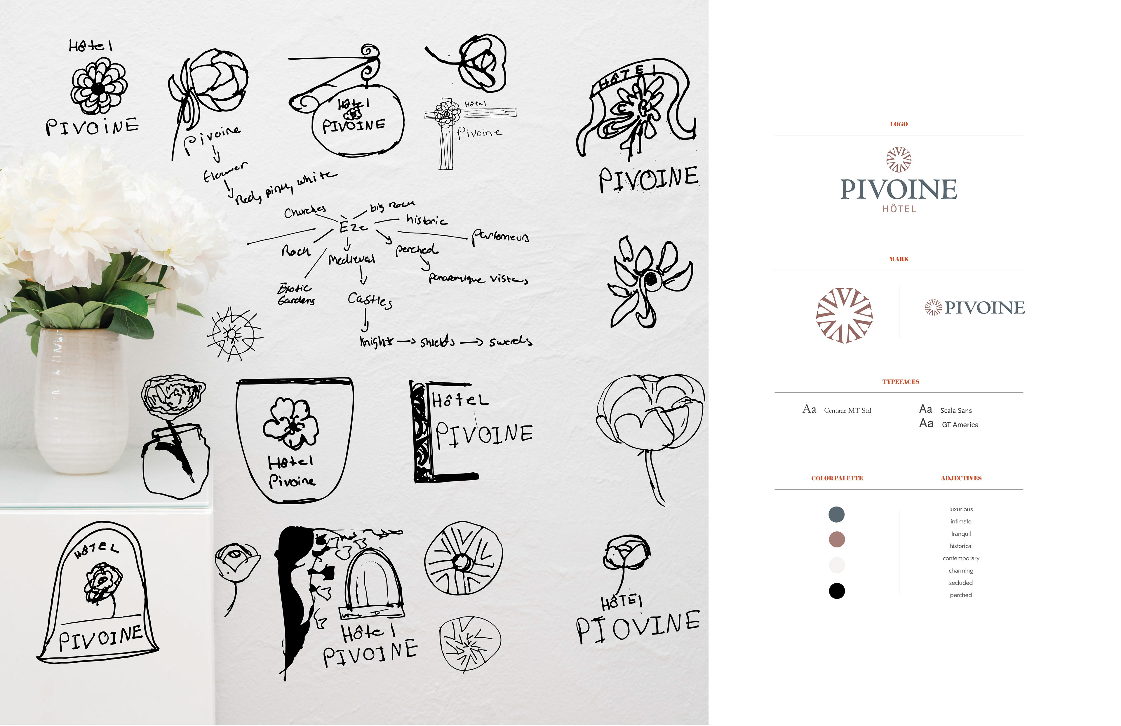
Hôtel Pivoine is a luxury boutique hotel on the French Riviera. The brand is inspired by
the unique historical location and the culture of the Côte d’Azur. It is nested on a hilltop
of the village of Èze facing the Mediterranean. I wanted to conceive a special and an affluent experience that communicates the spirit of the Village of Èze and the Côte d’Azure, by combining medieval and modern aspects to represent exquisiteness and tranquility in the different branded applications.
Solution
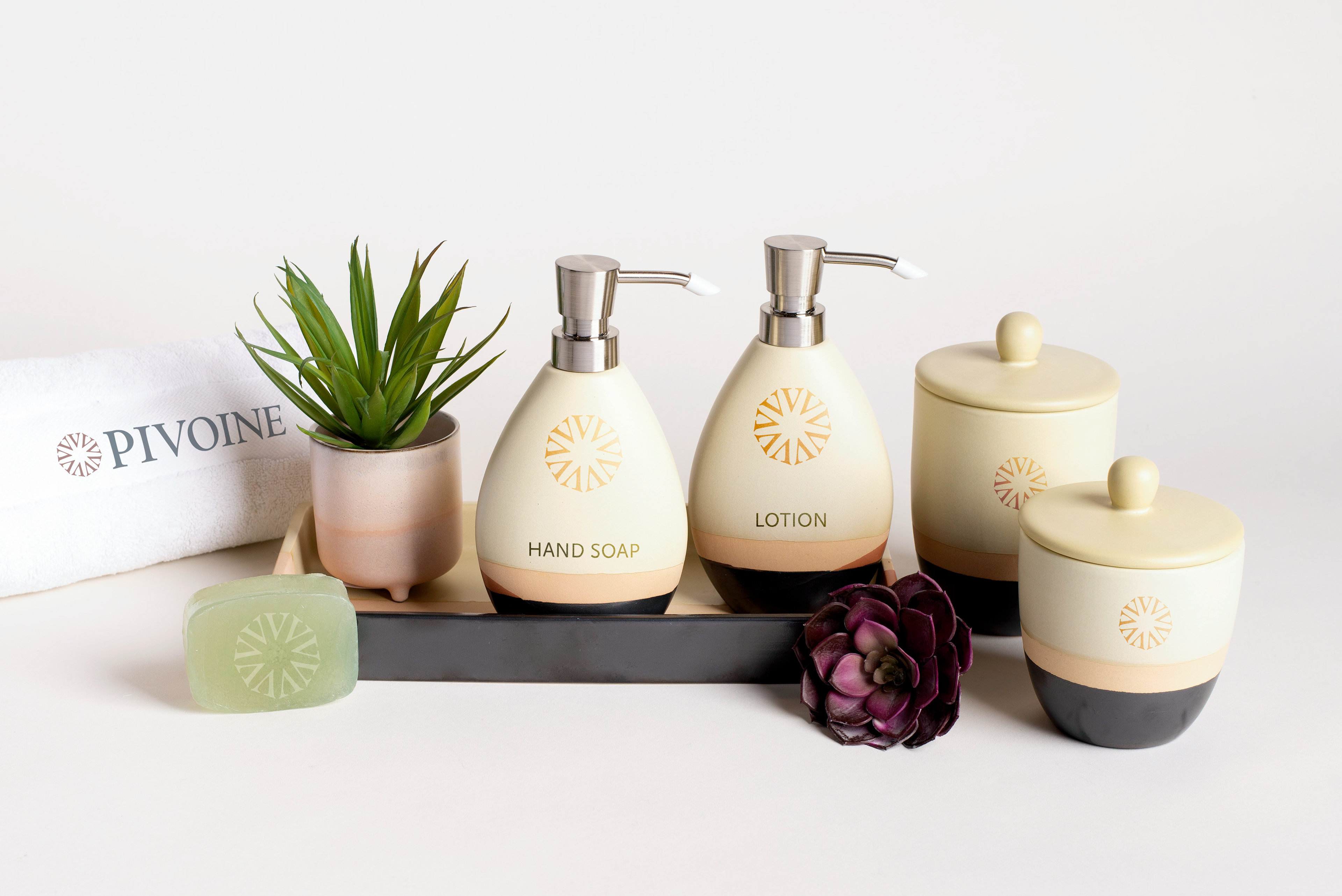
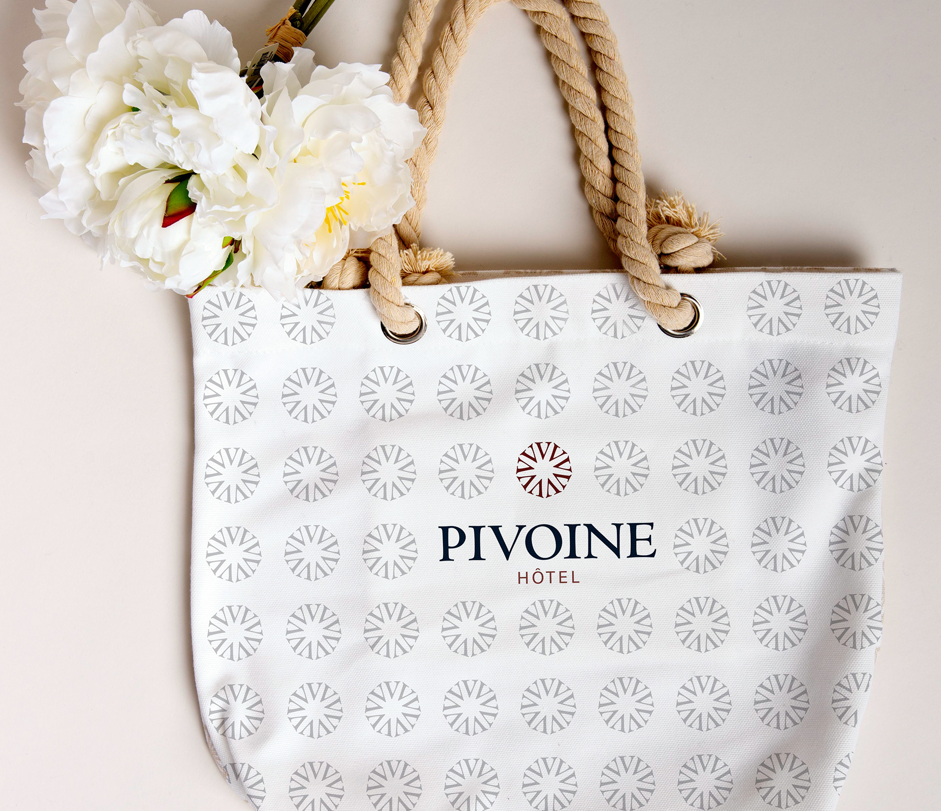
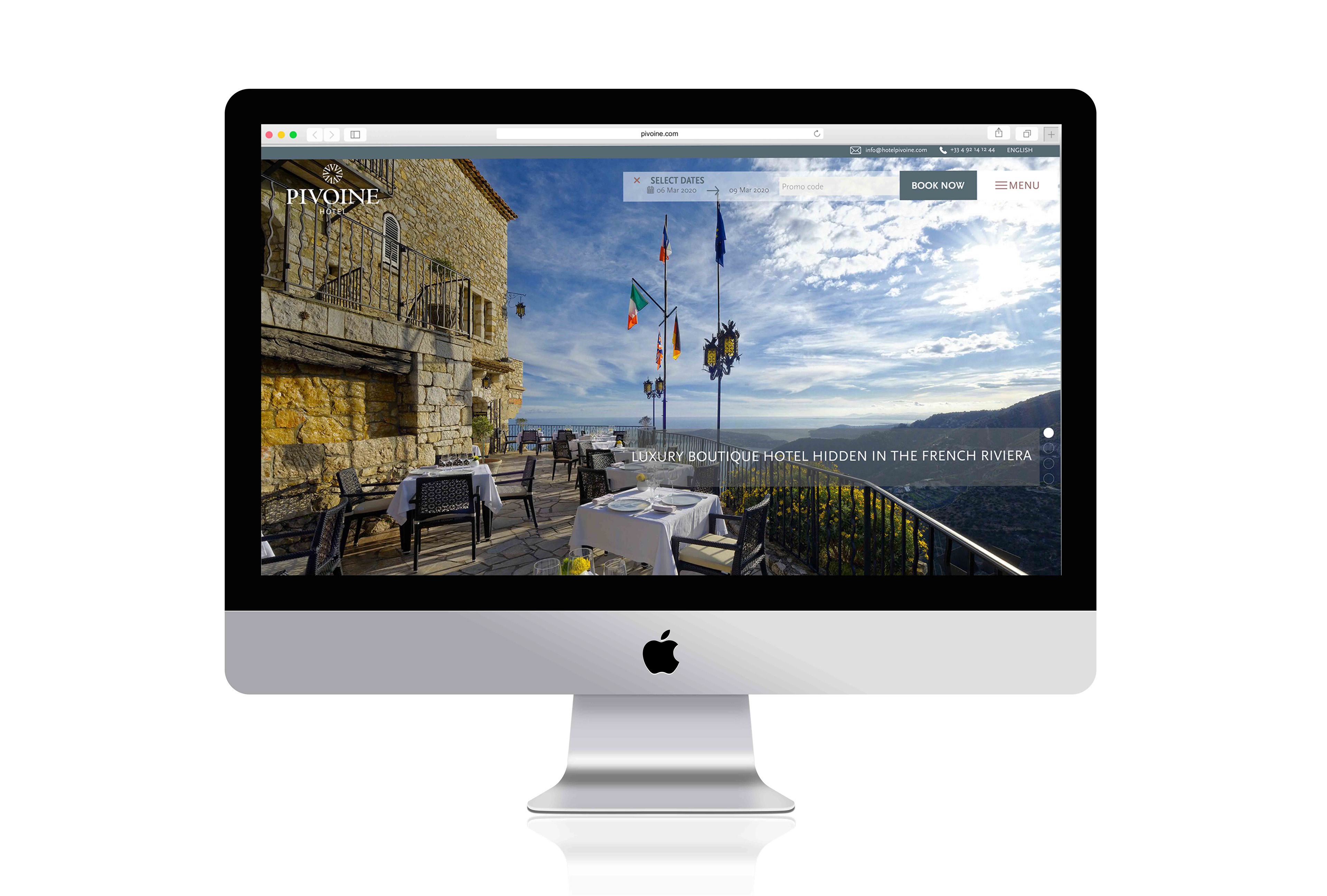
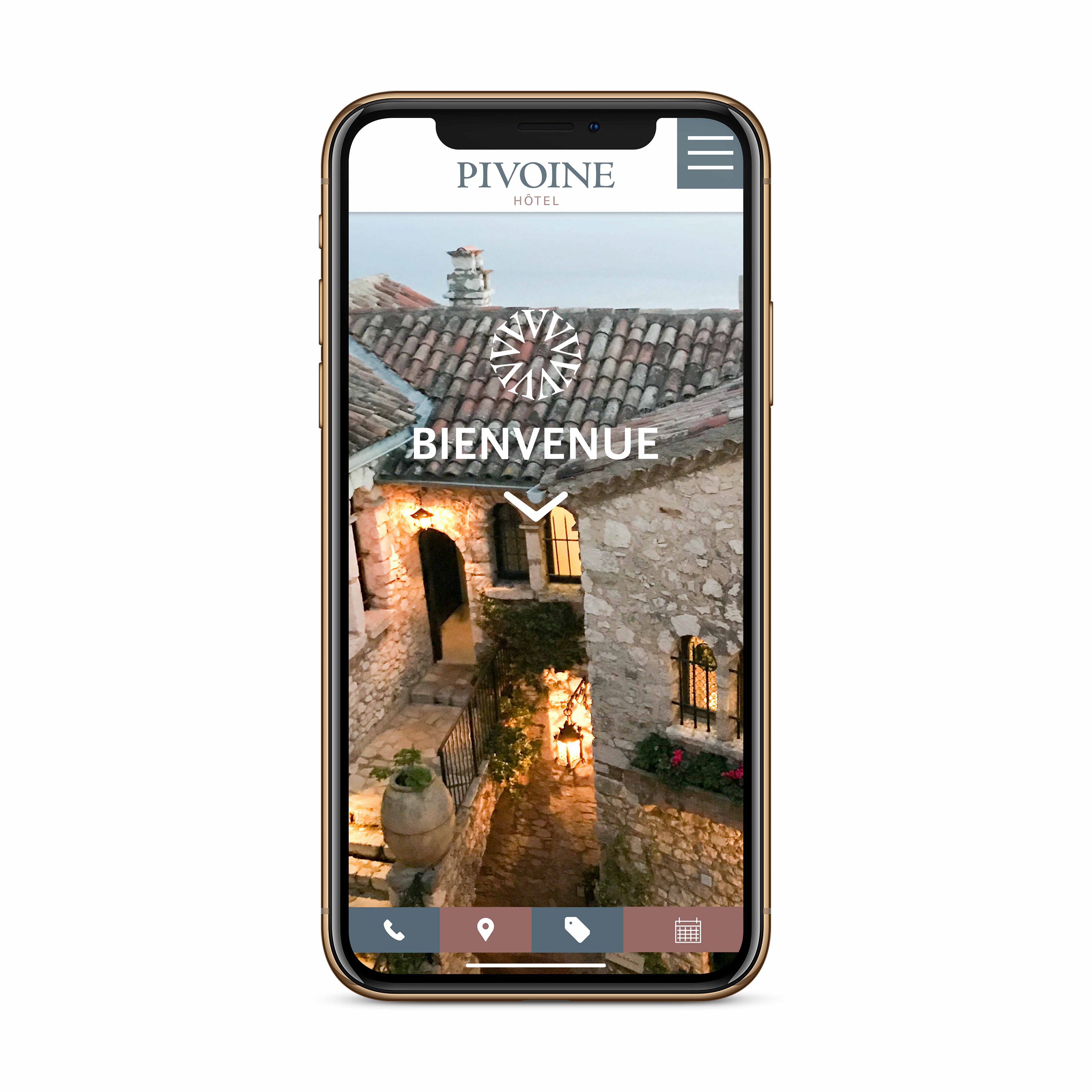
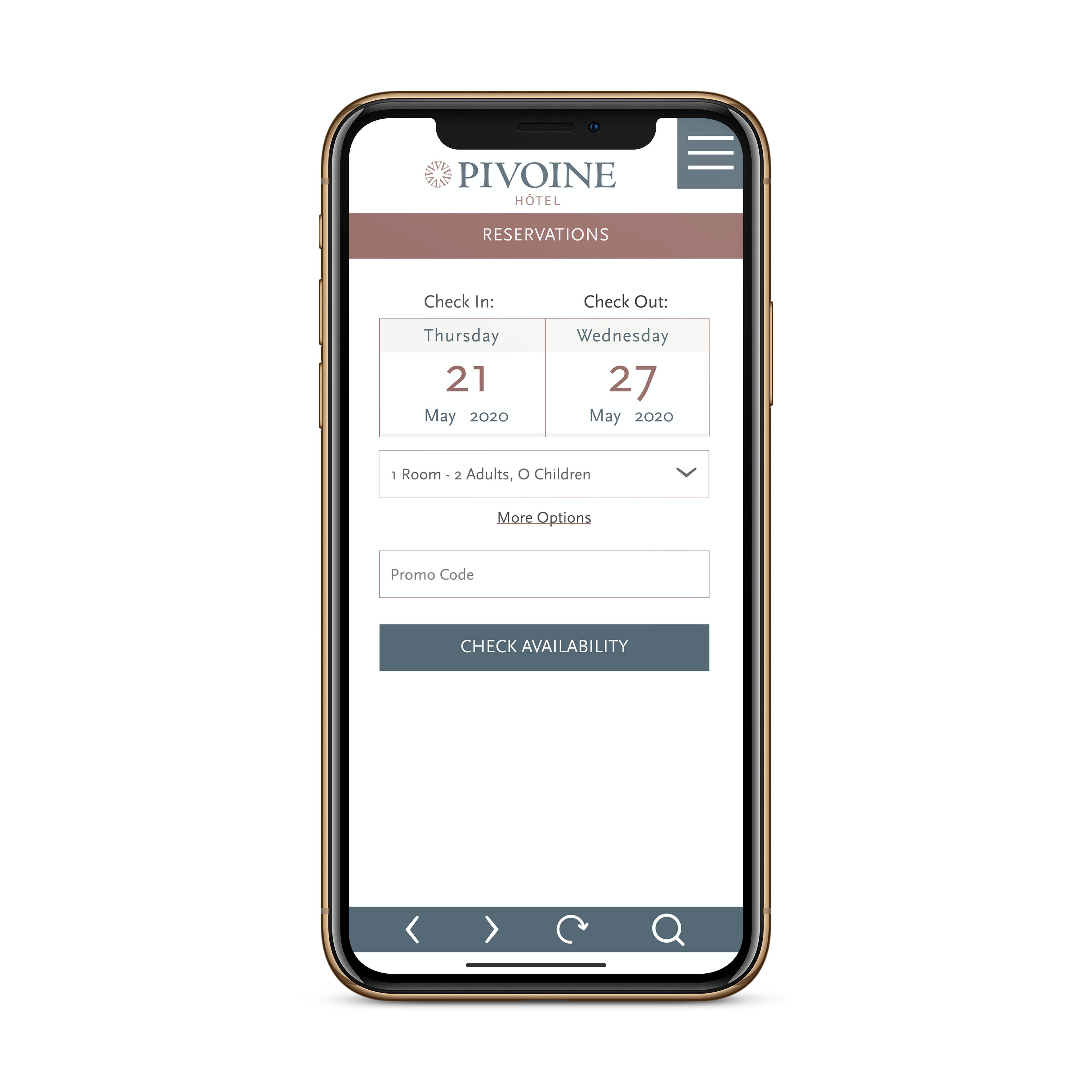
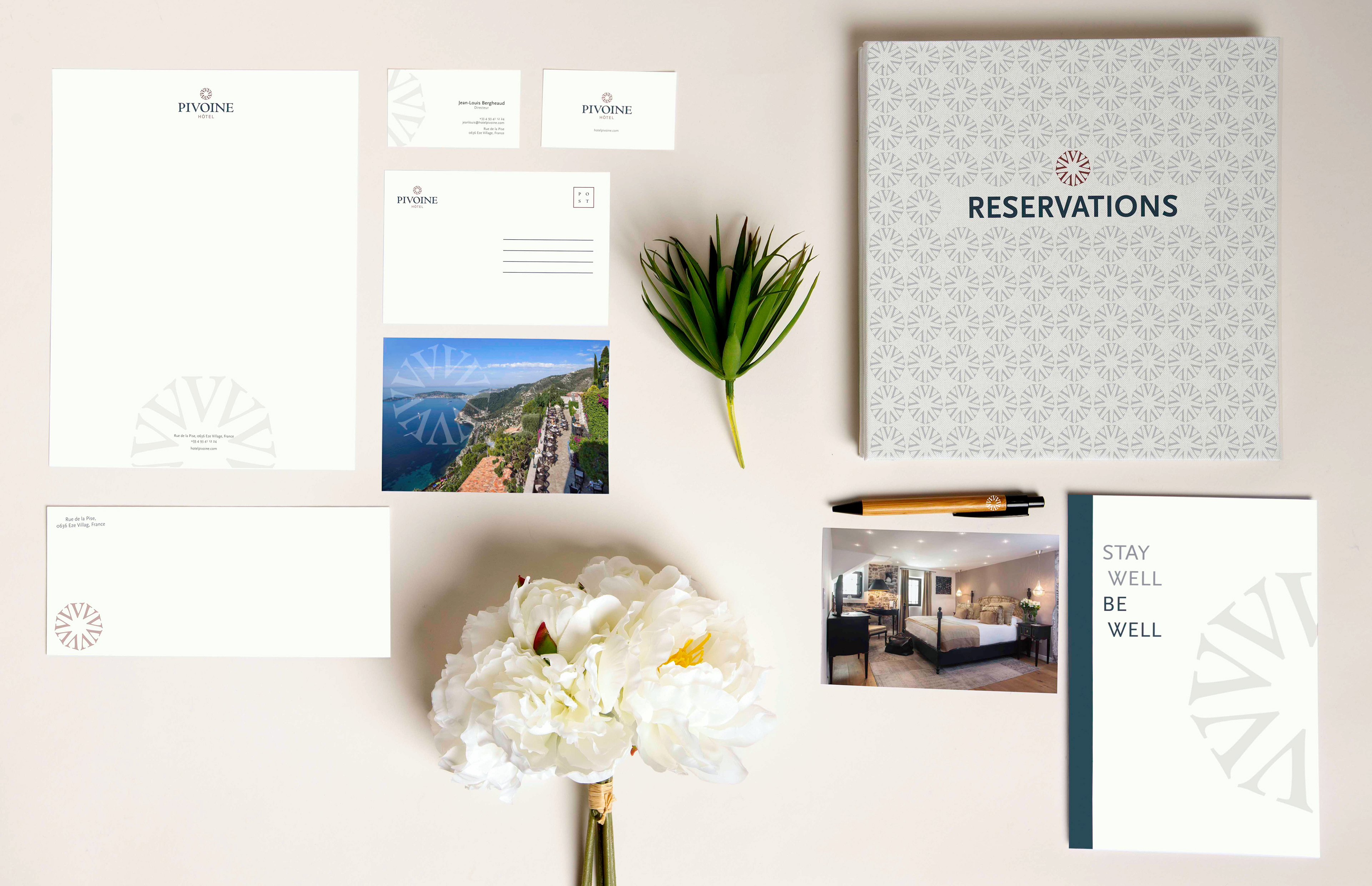
The logo, typography, color palette, and décor identify clearly with the brand, an amalgam of contemporary and medieval aspects. I created the mark, a peony (pivoine) flower from the glyphs of the typeface Centaur. It is the serif typeface that I selected to reference medievalism in the logo. GT America is also used in the logo. It is a modern, fresh, and sophisticated sans serif typeface. Scala Sans is a graceful sans serif typeface utilized as
the main typeface of the branded applications. I chose a simple elegant minimal color palette, comprising of three colors and two neutrals, that complement the primary hues
of the region, Côte d’Azure. The hotel is an ancient medieval structure and the interior is modernized with remanence of the original wood and stone. The furnishing reflects the current style of the French riviera.