
Objective
Mirabeau is a quarterly men’s magazine. It focuses on the ever-changing world of fashion, beauty, and travel. It targets an audience who prefer specifically modern and classical European fashion. Mirabeau is built on the belief that fashion should be shot beautifully and supplemented with exclusive interviews, ground-breaking editorial features, and powerful opinionated journalism. Thus, it strives to be a definitive voice in luxury men’s fashion.
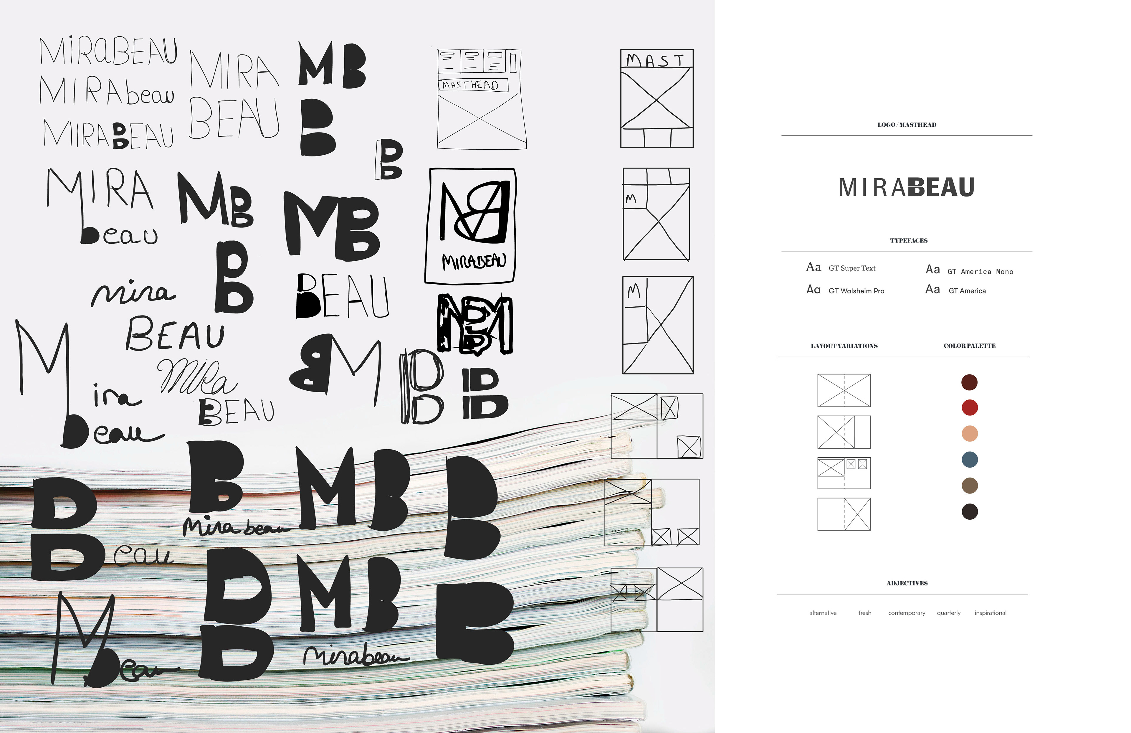
Solution
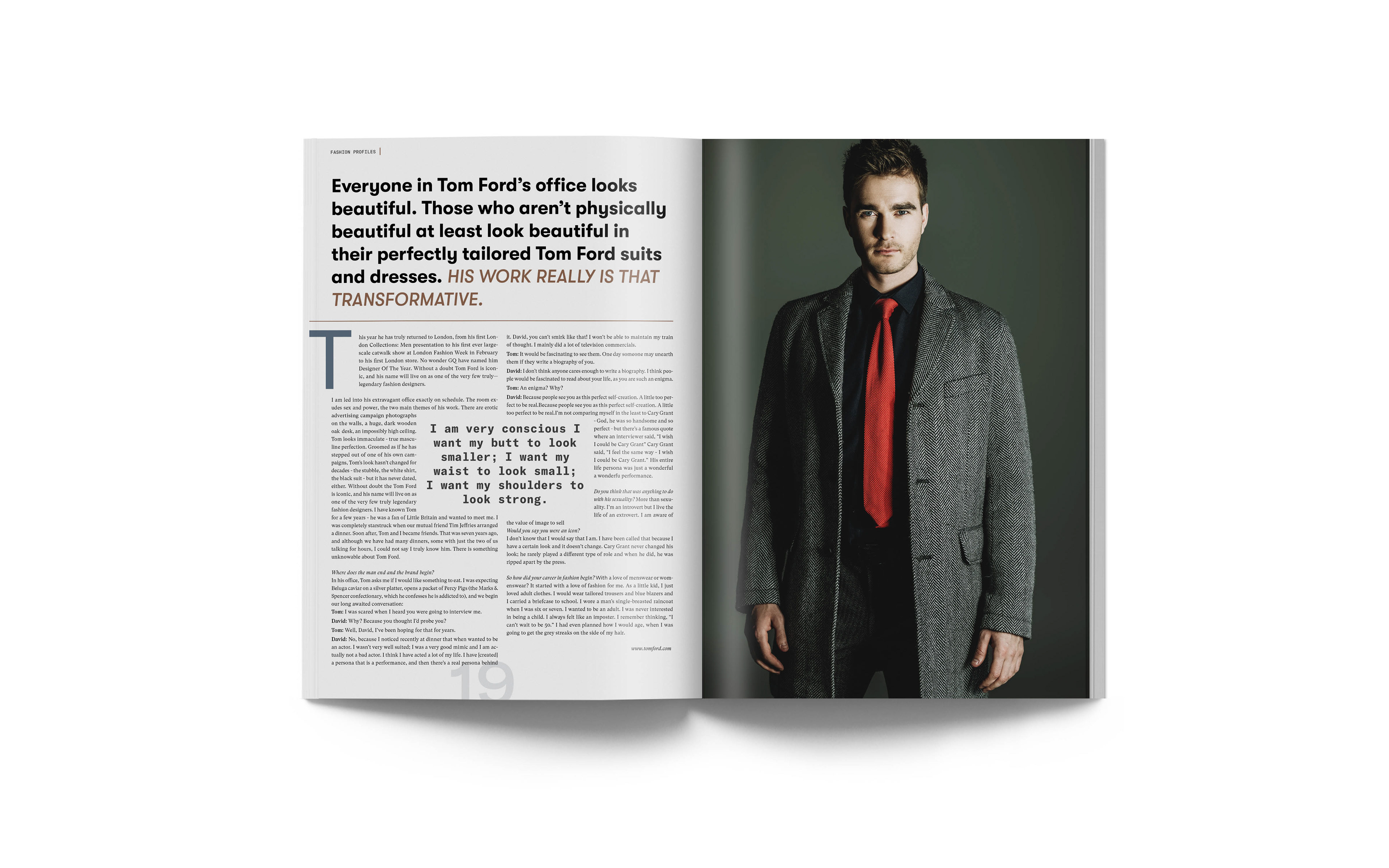
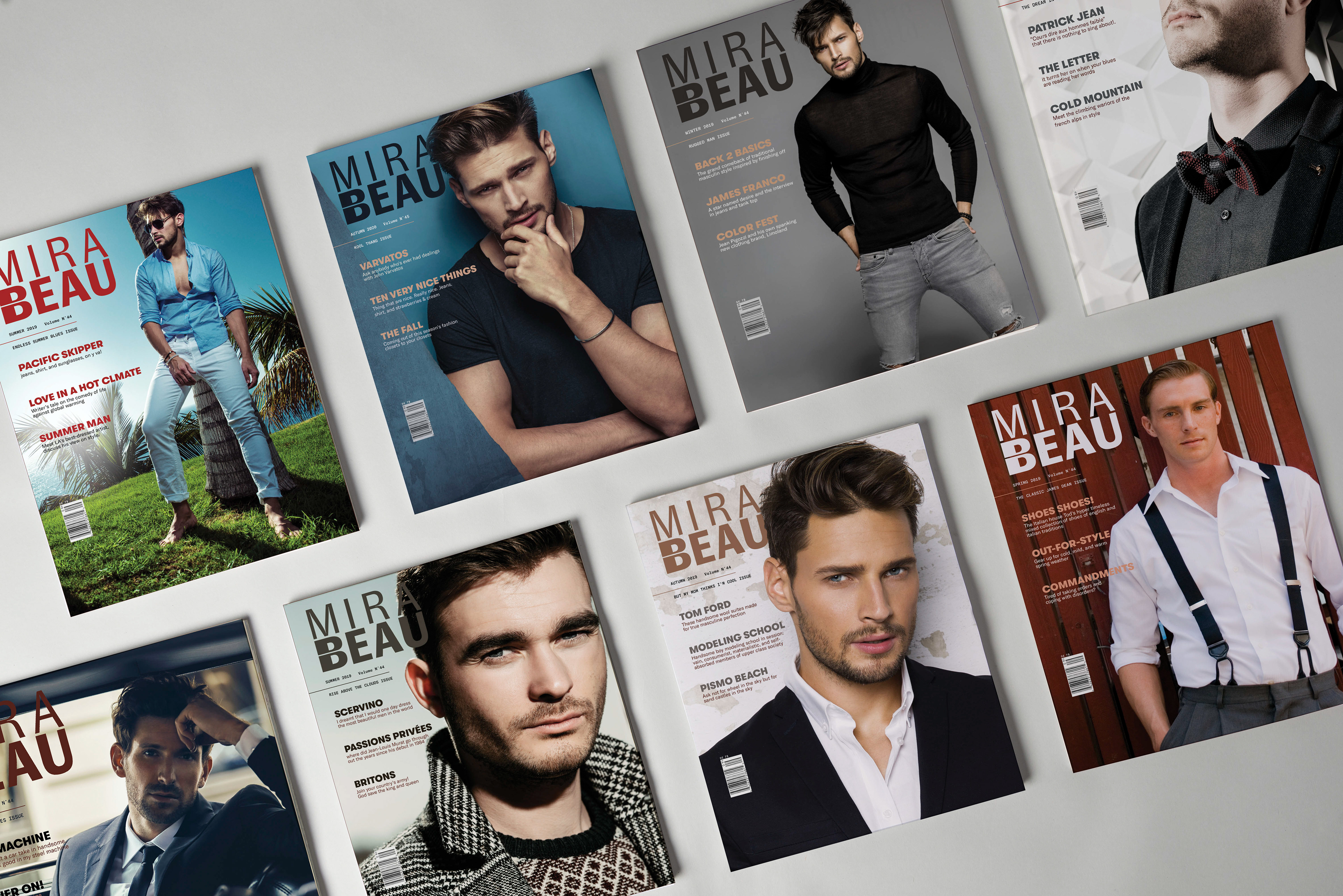
Luxury fashion originates from Europe, therefore I chose the name Mirabeau after a noble French family. The covers feature beautifully photographed stylized models, with call-outs in a carefully crafted hierarchical order under the masthead. Typefaces from the Swiss Grilli foundry were chosen for their connection to the Swiss tradition and their ability to convey a contemporary aesthetic. The masthead is a typographically modified form of GT Zirkon, separated into two well balanced rows, ensuring that the cover photo is visible at all time. The color palette is derived from cover photo and the photos of the featured article.
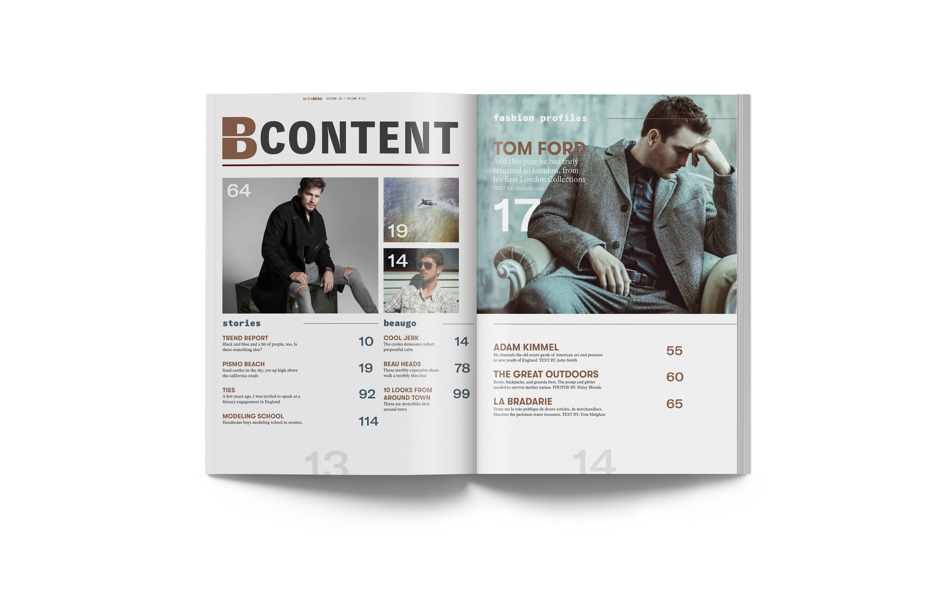
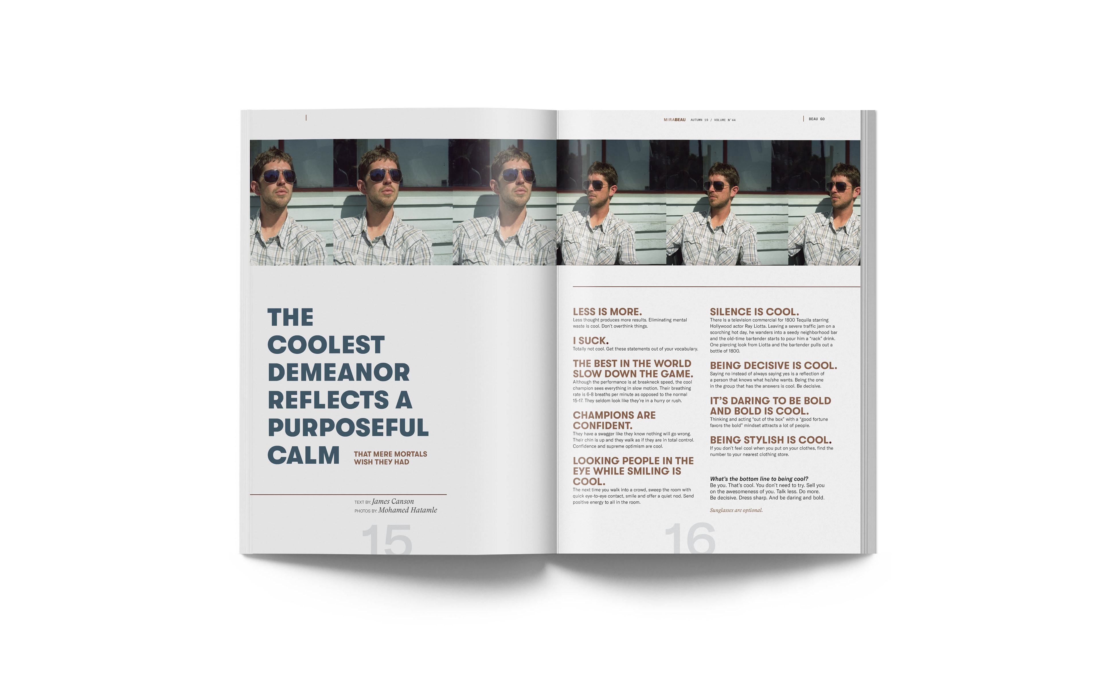
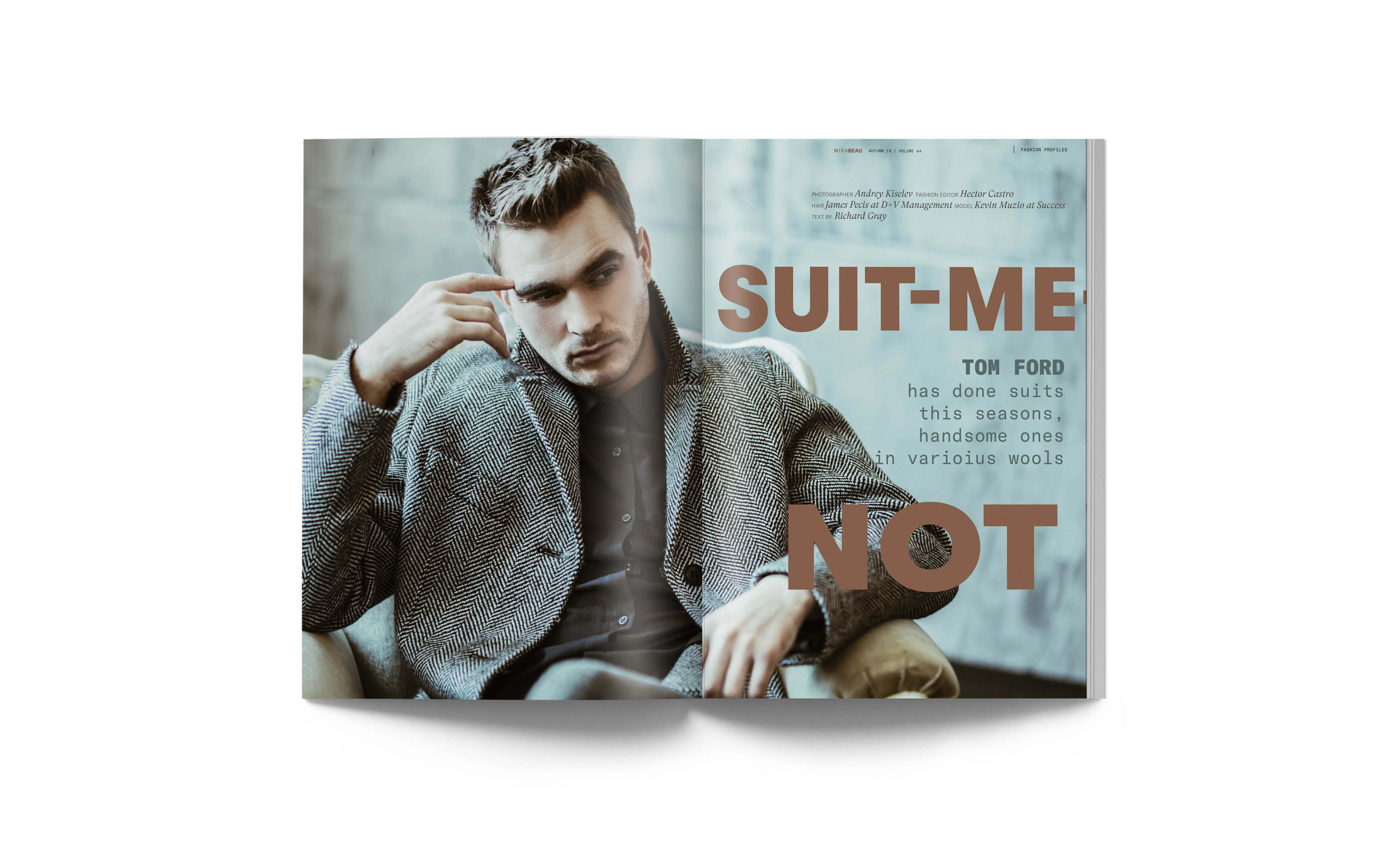
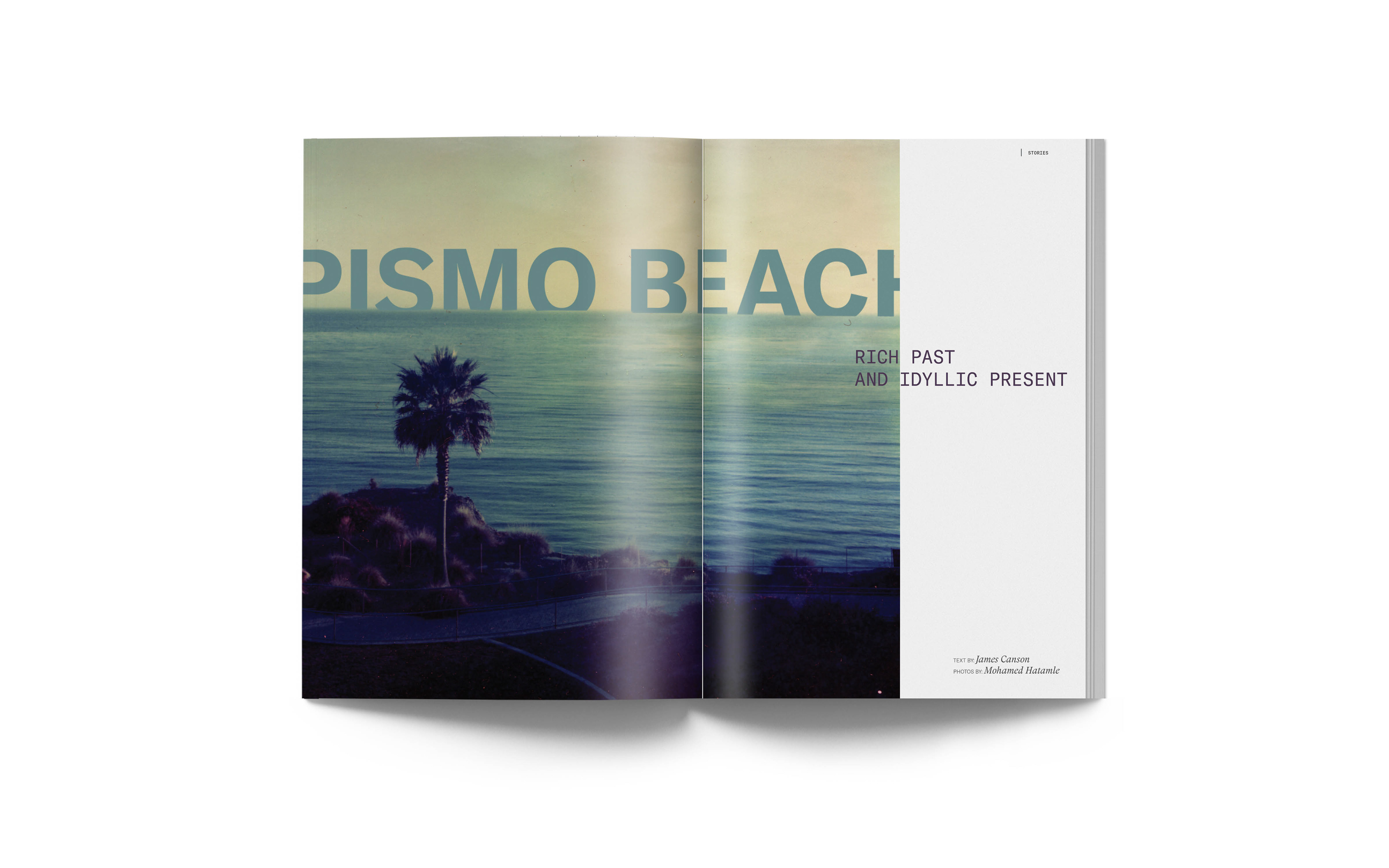
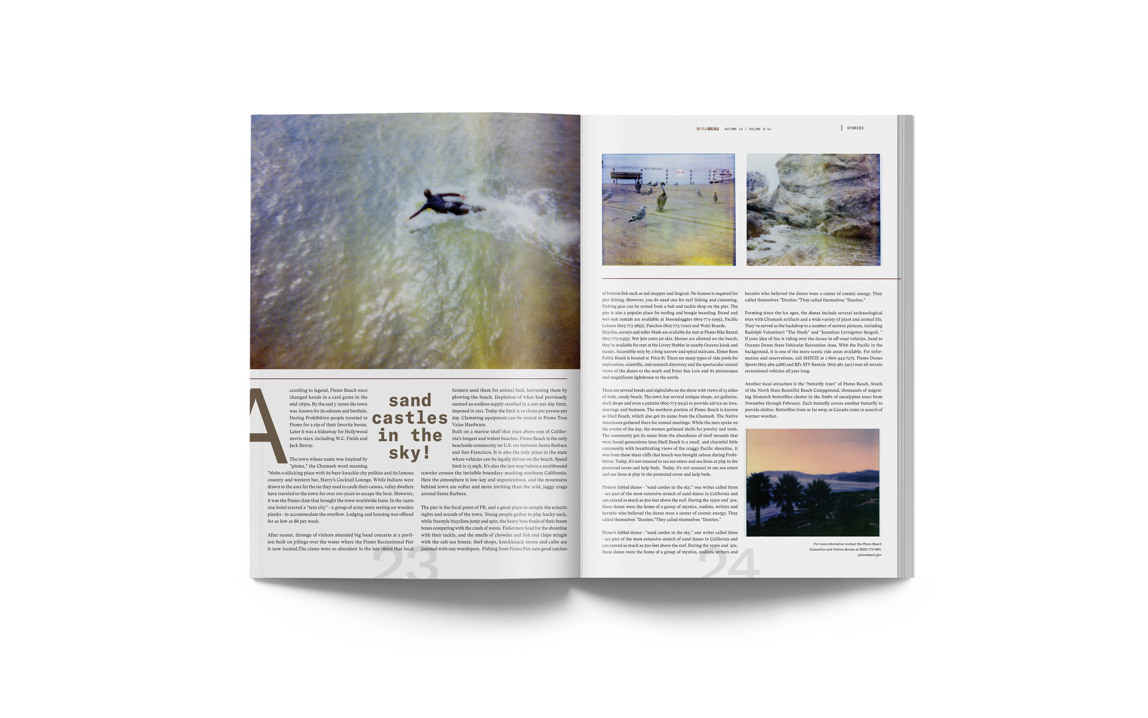
The interior layout utilizes a modest 6 column grid with strong whitespace and
typographic hierarchy.
The interior layout utilizes a modest 6 column grid with strong whitespace and
typographic hierarchy.
]