Overview
Almoo is a new brand of almond milk, that brand primarily targets parents of children who are seeking healthy dairy-free beverage. Almoo strives to be not just an alternative dairy-free beverage but a healthy plant-based beverage that parents and children will choose to drink and has a rightful place on the shelves of markets. Unlike its dull competitors, Almoo will be special for its brand message, design, and packaging.
Solution
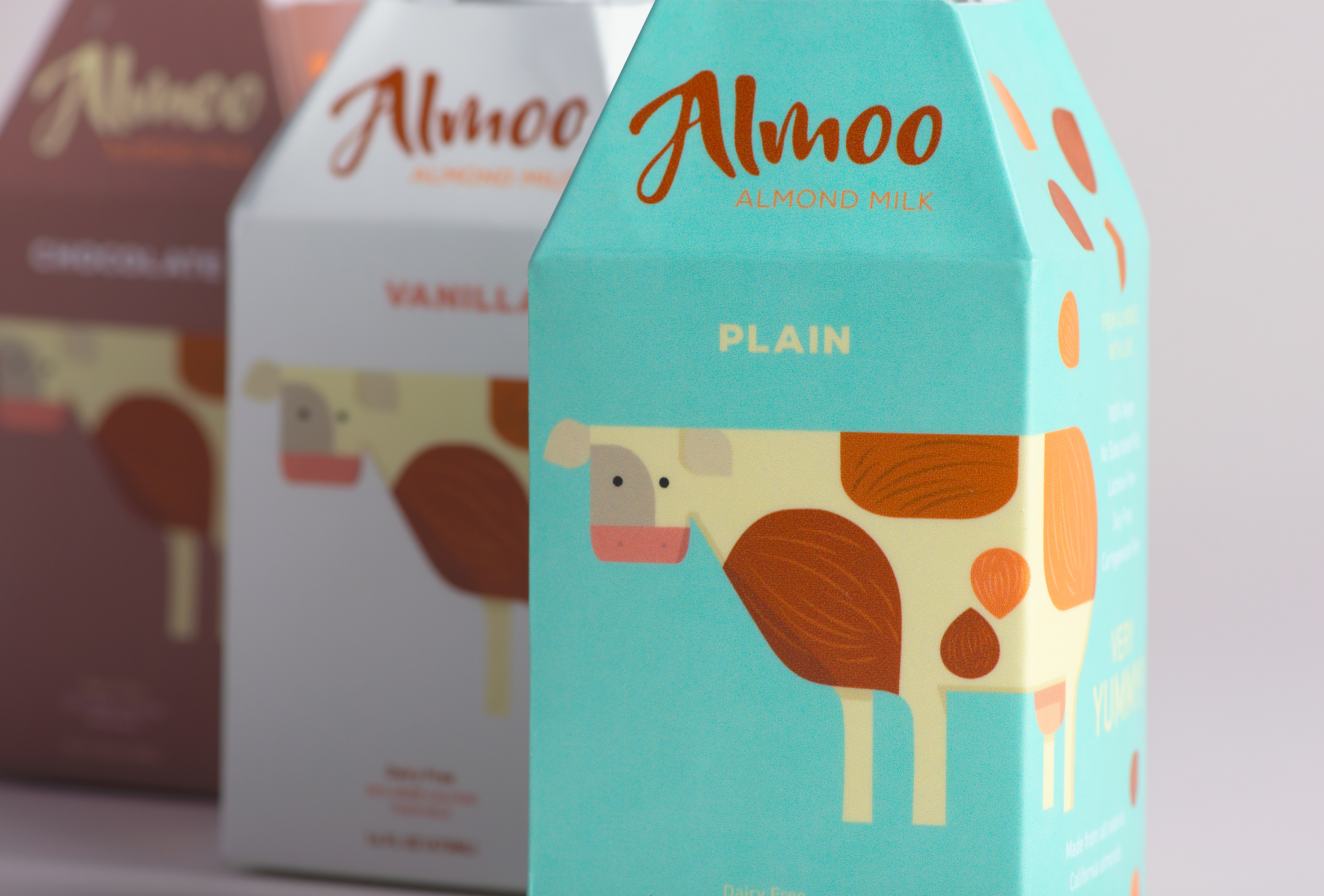
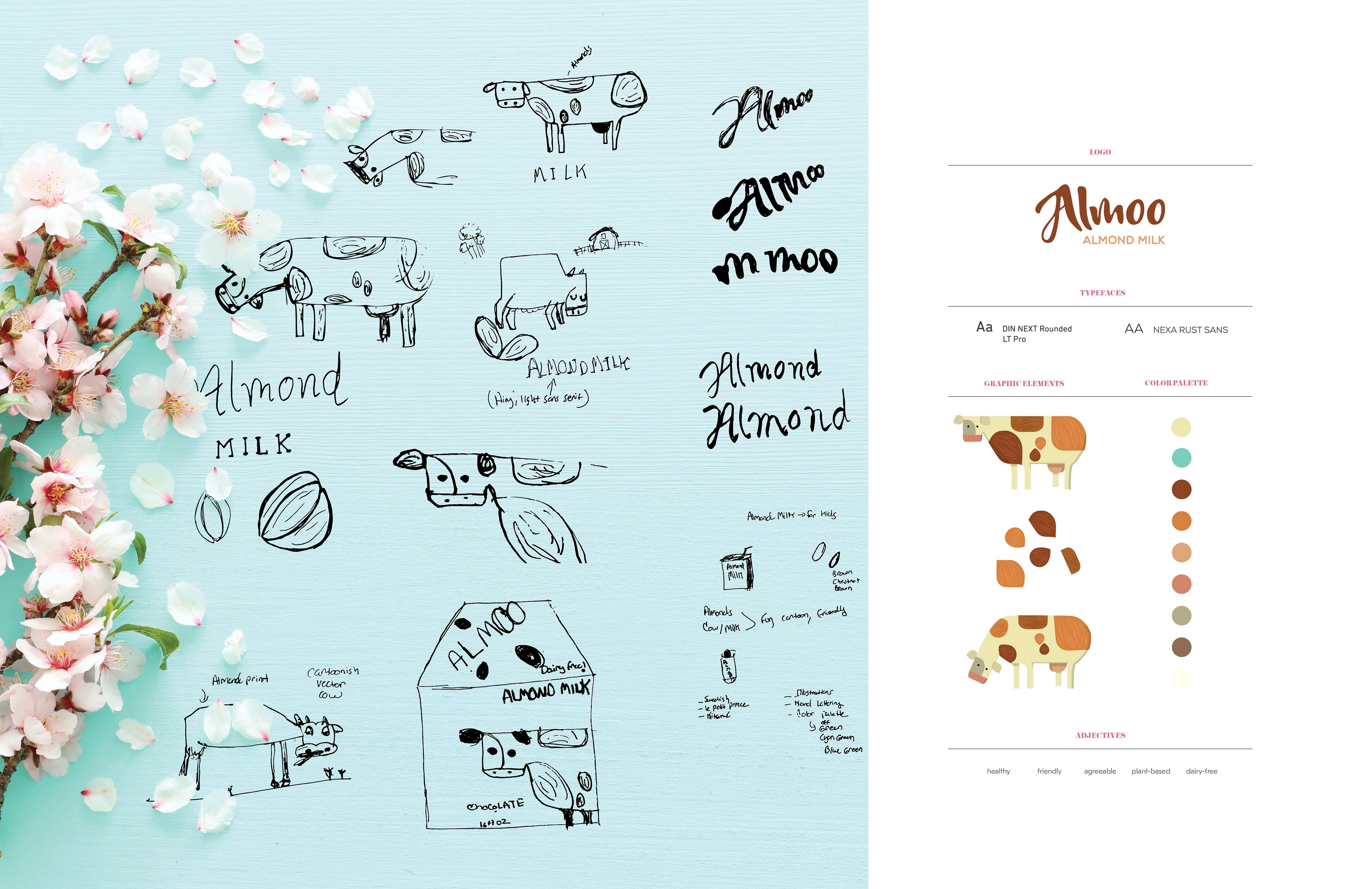
I wanted to conceive a unique name and a design that is friendly, puerile, and approachable to the target audience, parents, and children. The name Almoo is a portmanteau of the words: almonds and moo (the vocal characteristic of a cow), in
attempt to provoke the curiosity of my target audience. I decided that a hand-lettered
logo would help to add a touch of distinction, accessibility, and quality to the brand.
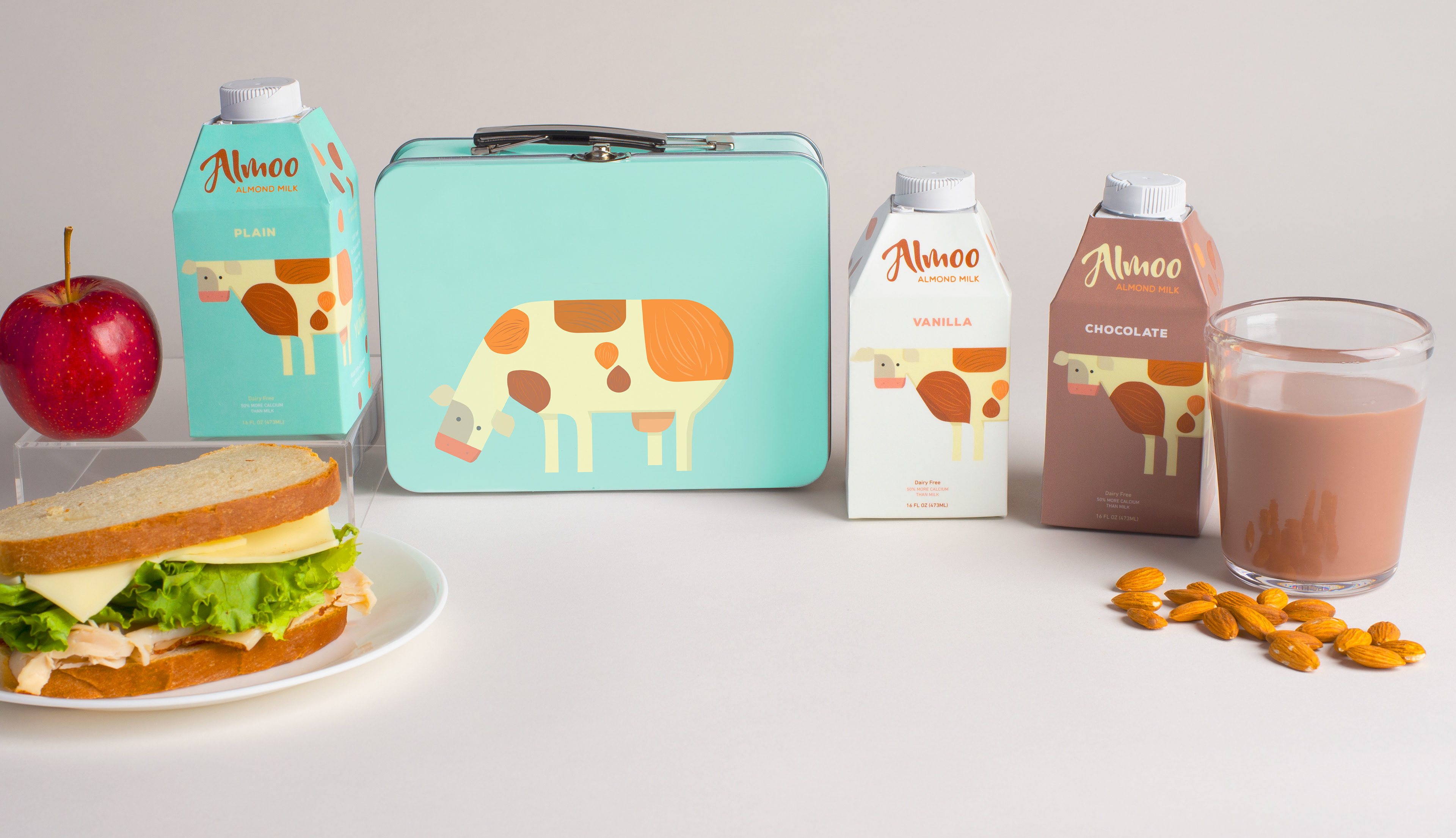
I created a custom and witty illustration to be identified as the ambassador of the brand,
a cow with almond prints. The color palette is derived from the various hues of almonds and almond shells, each flavor of the Almoo packaging will have its own color.
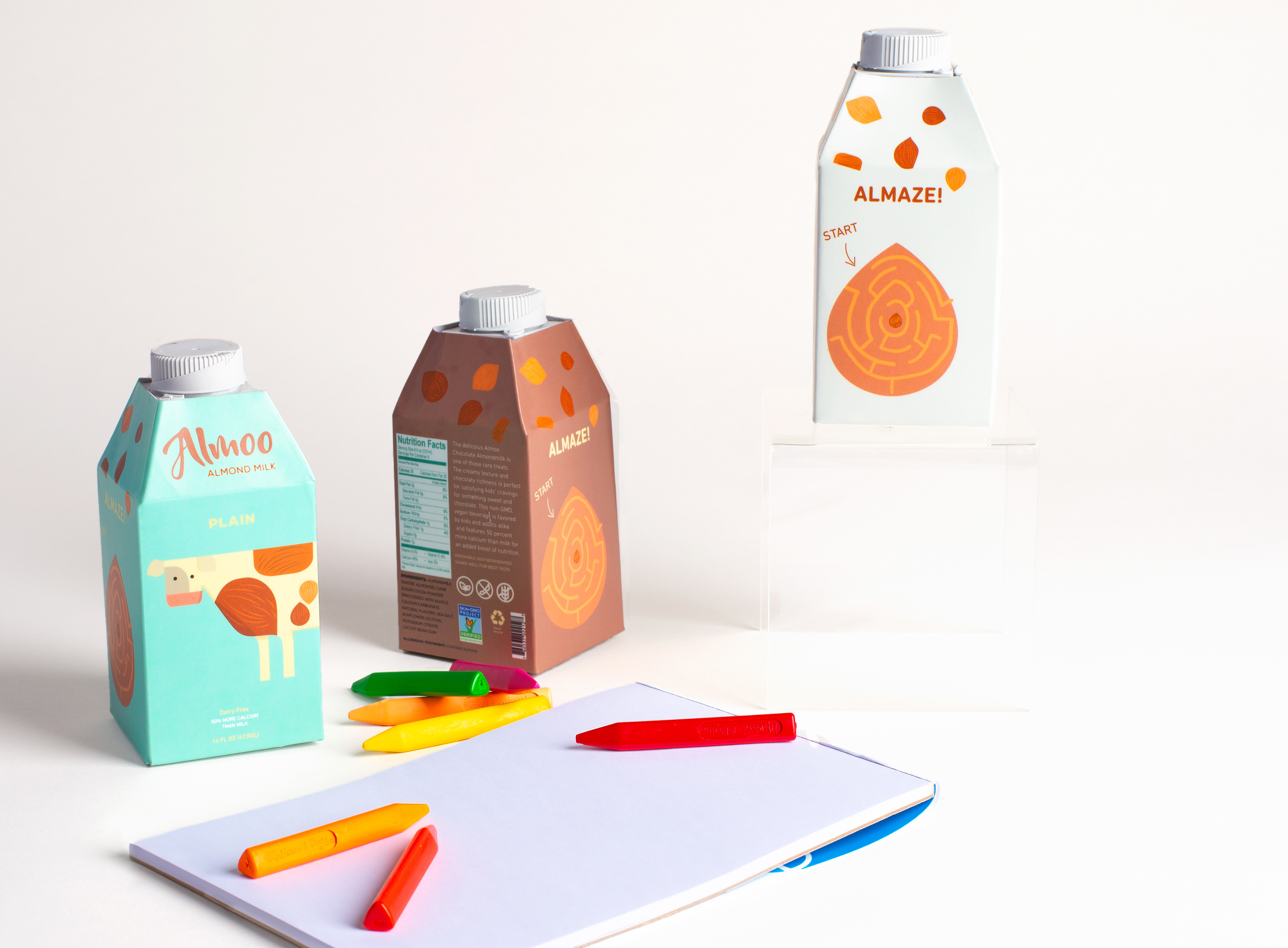
The packaging is a four-panel carton, suitable for kids and storing in a lunchbox. I designed a maze on the fourth panel to add a pleasant interactive experience. DIN NEXT Rounde LT Pro and Nexa Rust sans are rounded, soft, and all caps typefaces that appear friendly, positive, and legible, especially to children.
attempt to provoke the curiosity of my target audience. I decided that a hand-lettered
logo would help to add a touch of distinction, accessibility, and quality to the brand.
I created a custom and witty illustration to be identified as the ambassador of the brand,
a cow with almond prints. The color palette is derived from the various hues of almonds and almond shells, each flavor of the Almoo packaging will have its own color.
The packaging is a four-panel carton, suitable for kids and storing in a lunchbox. I designed a maze on the fourth panel to add a pleasant interactive experience. DIN NEXT Rounde LT Pro and Nexa Rust sans are rounded, soft, and all caps typefaces that appear friendly, positive, and legible, especially to children.